Punchbowl News
A complete website redesign on a tight timeline (coinciding with their one-year anniversary) for a membership-based political news community, with the goal of subscriber retention and growth.

Overview
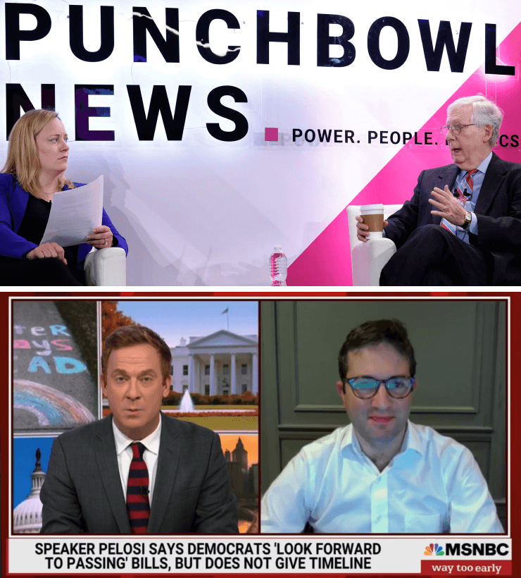
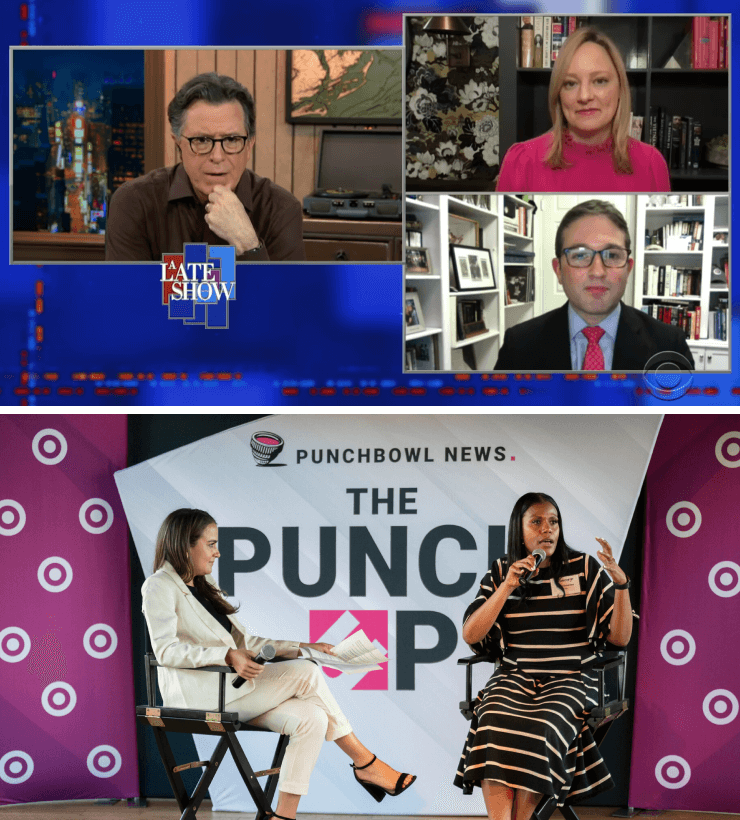
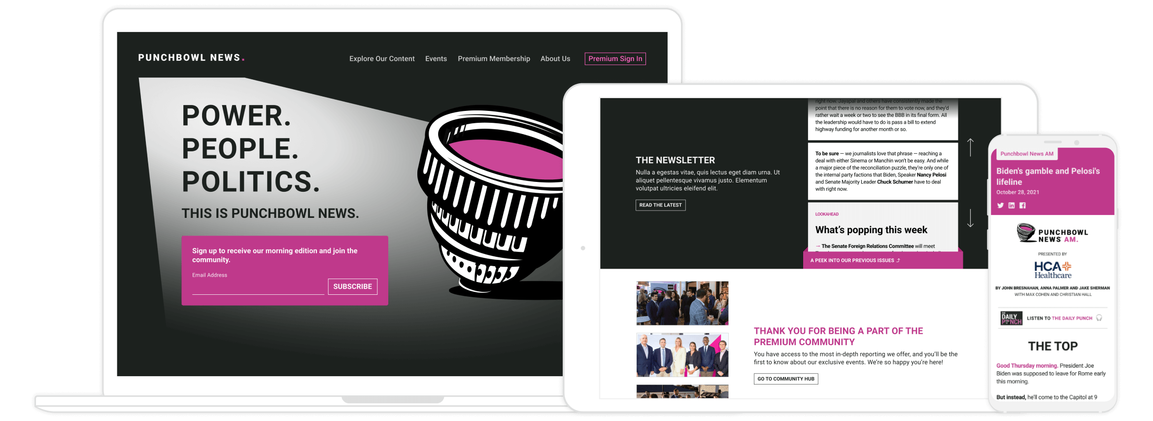
Founded by highly respected ex-Politico journalists with a loyal following in the political sphere, Punchbowl News’ flagship product is a thrice-daily political newsletter featuring unbiased, insider reporting from Washington, DC and beyond. With exclusive VIP events, long-form editorial pieces, a daily podcast and more, Punchbowl News offers a wealth of high quality content that their audience genuinely values, but their previous website (featuring only an email capture on the homepage) did little to communicate as such.
Punchbowl News’ primary concern was subscriber retention as they approached their one-year anniversary—a critical moment for the company—as paid subscribers would be deciding whether or not they wanted to renew for another year. Despite the tight timeline and an extraordinarily busy client, our team was able to pull off a top-to-bottom redesign of their website that provided added value to existing subscribers while improving the subscription funnel for new ones.
MY ROLE
Product design lead, user research partner, content and product strategy
PROJECT TEAMMATES
Product Manager
Product Designer
5 Engineers
DESIGN TIMELINE
MVP: 5 months
Post-MVP Features: 2 months
Event Series Addition: 1 month
Discovery & Research
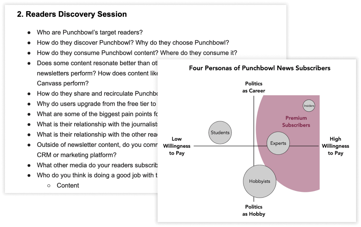
Punchbowl News already had a working understanding of their audience, thanks to existing newsletter analytics and user surveys they’d previously sent out, so my fellow product designer and I started our research there. This was followed by our own user surveys—both qualitative and quantitative—and interviews with several of their subscribers directly in order to learn more about the features that appealed to them, the types of people that made up their audience, and what kept them coming back to Punchbowl News.
We also conducted a competitive analysis and held several stakeholder interviews with Punchbowl News’ co-founders, diving into everything from the client’s goals for the redesign, to their advertisers and sponsors, as well as how they thought about their subscriber community.
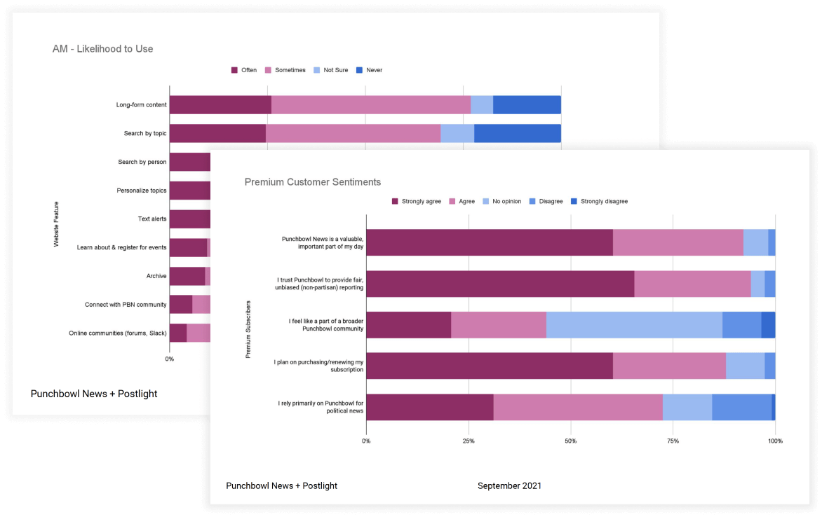
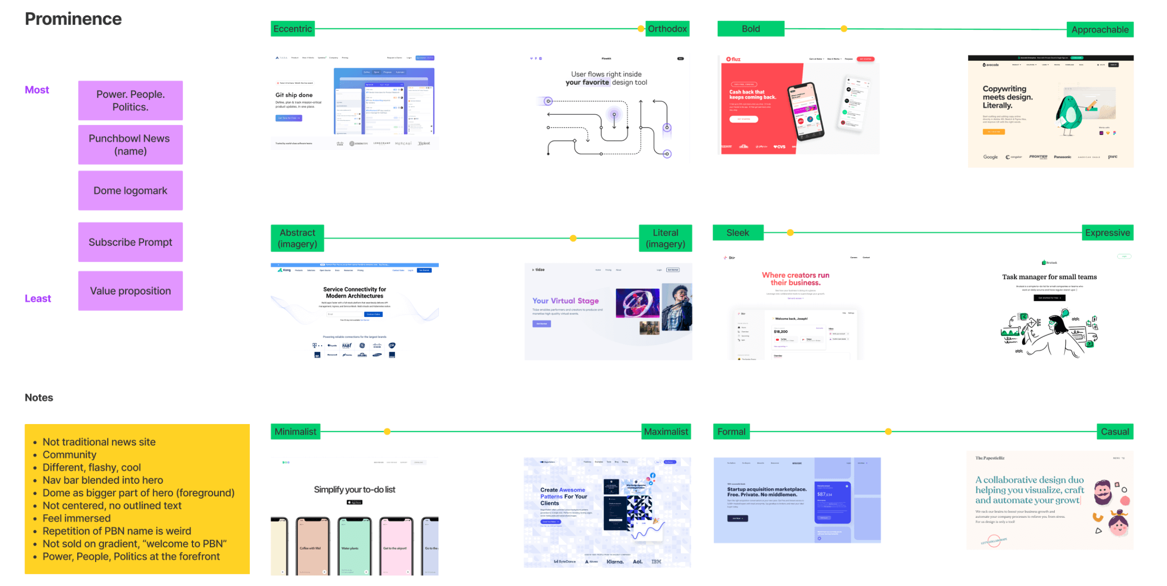
In a space that is known for divisiveness and polarization, we were surprised by just how positive the audience response was—readers across the political spectrum commended Punchbowl News for the quality of their unbiased content, and often preferred their reporting over any other political news source. Leading with content became my guiding principle while revamping their website’s information architecture, and informed my decision to suggest a free trial for their subscription flow. Not only was this feature something I noticed many of their competitors offered, but it helped solve for a notable friction point in their subscription funnel: the price.
A Bespoke Experience
Punchbowl News had over 100,000 subscribers for their AM newsletter (which is offered free of charge)—an impressive number given they had only been in existence for less than a year at the time. However, subscriptions had started to plateau, so aside from a general growth of their audience and brand, Punchbowl News also wanted to increase the number of paid subscribers (or “Premium members”).
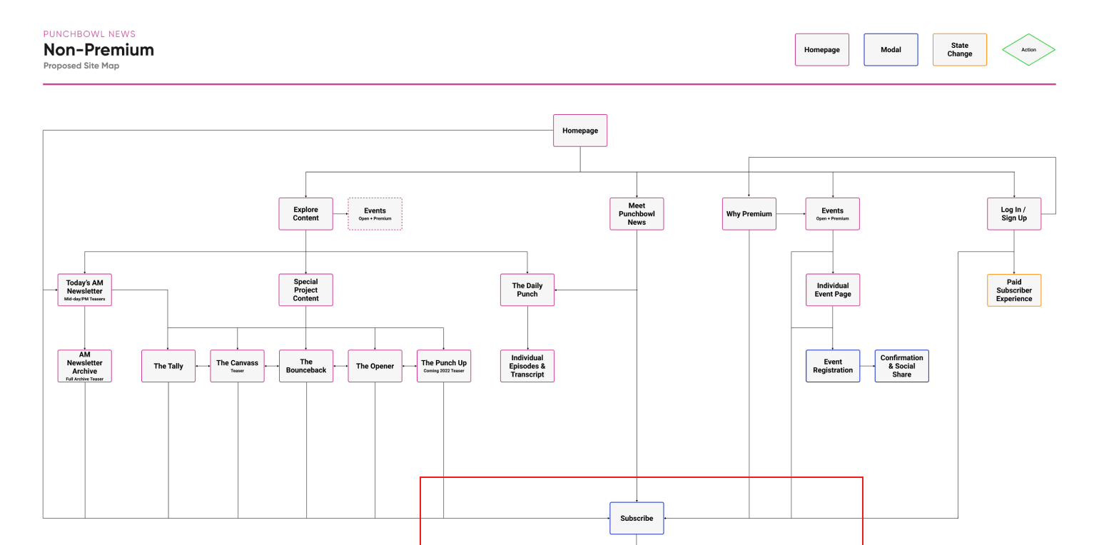
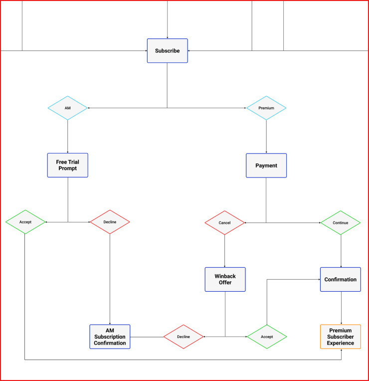
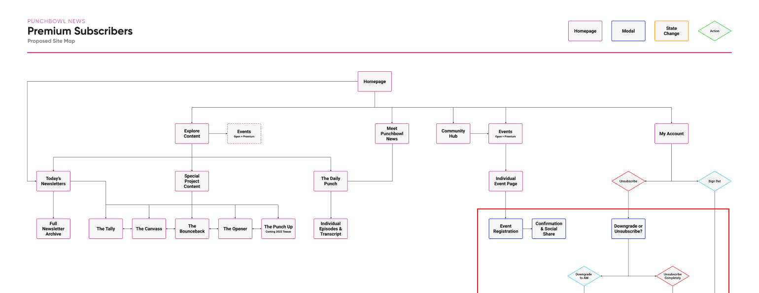
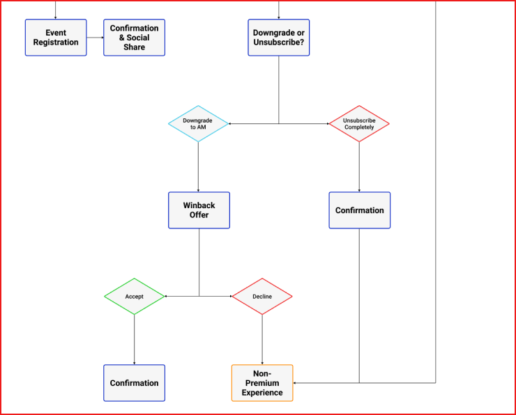
The final IA was built upon a clearer differentiation between these two distinct user states on the website: the logged in, authenticated state (Premium subscriber) and the logged out state (AM subscriber or non-subscriber). The redesigned experience was tailored so that Non-Premium users are prompted to subscribe in order to reveal the full spectrum of content they’re actively previewing, while Premium users get a distraction-free experience with unrestricted access to the content they're paying for.
The Design Process
The client had never worked with a product design & development agency before, so the wireframe phase proved challenging in terms of getting my initial ideas across. Where lower fidelity wireframes might have worked elsewhere, for Punchbowl News there was a fair amount of education on the design process as a whole, so a tighter, more detailed set of wireframes was required to move us toward the next step: high fidelity designs.
Initial round of wires → high fidelity wires → final design for a section of the homepage
Their existing brand guidelines were very sparse, so I referenced any other collateral I could get my hands on—event flyers, sponsorship decks, as well as the newsletter itself—to guide the design direction of the website itself. It was important to both the client and to us that the burgeoning brand stayed consistent across all touchpoints even as our track of work was really only touching one of them. As a result, we couldn’t stray too far from how Punchbowl News was already presenting themselves, despite developing a vast selection of new components and design patterns for the redesigned website.
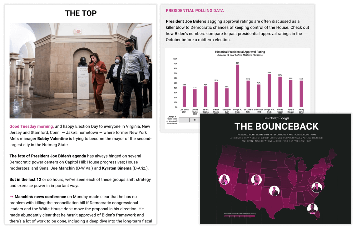
Examples of the AM newsletter & original editorial content
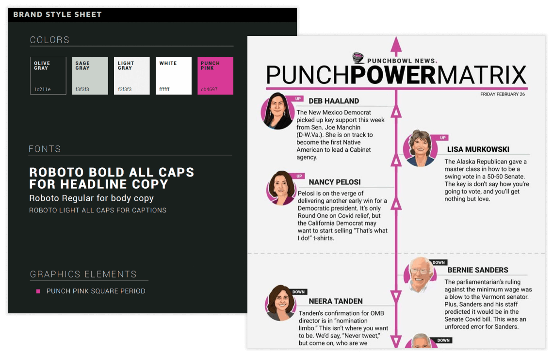
Existing brand guidelines & example of feature content
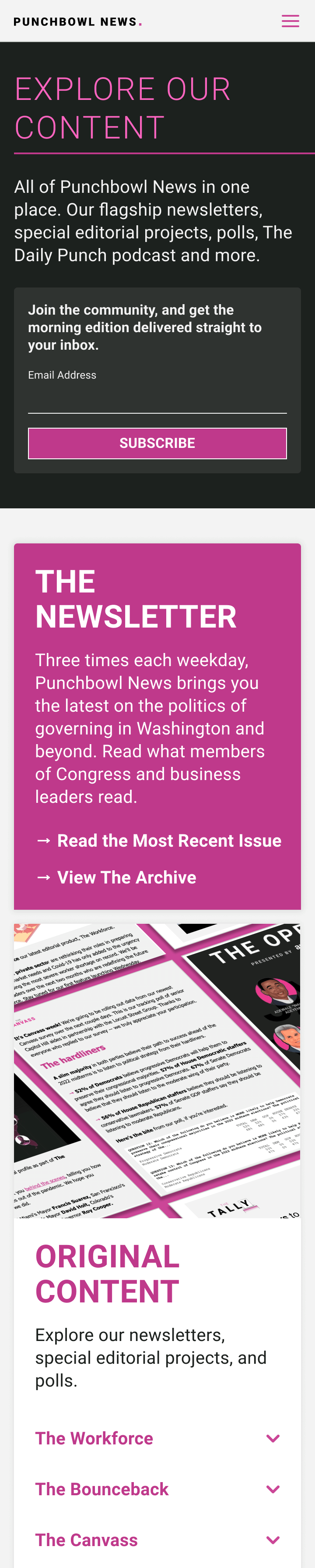
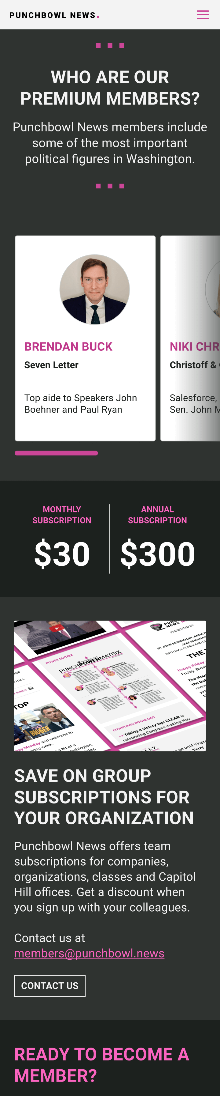
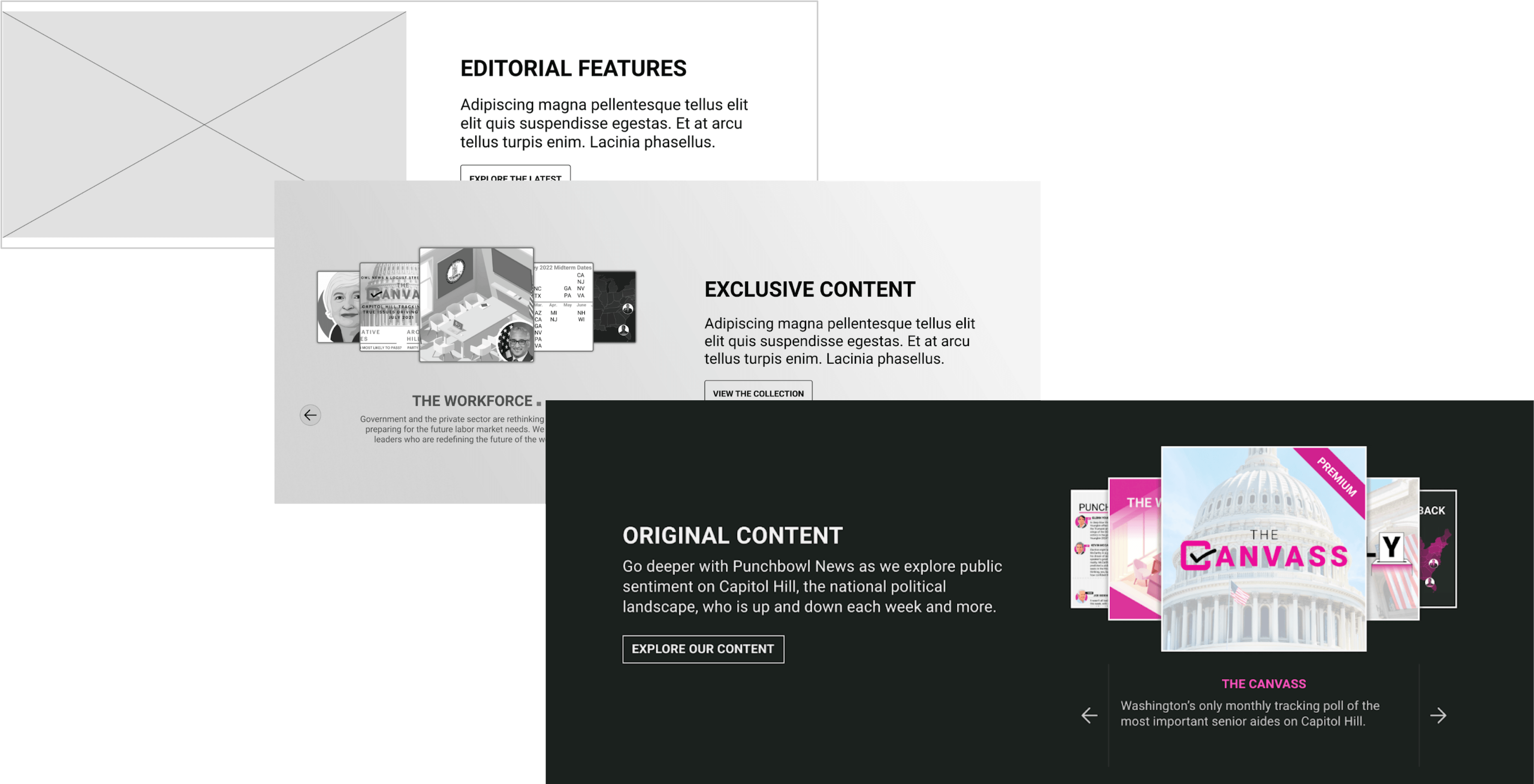
Existing brand elements translated into new designs for Explore Our Content, Punchbowl News Premium, and Events pages
Existing brand elements translated into new designs for Explore Our Content, Punchbowl News Premium, and Events pages
One particular sticking point was the homepage, specifically its hero section. Following the same design approval process as I'd used for the rest of the website’s pages proved ineffective here, as the client had a specific vision for the hero’s look and feel but was unsure of how to articulate it. I decided to run a workshop that provided them with the necessary language for doing so, and got both myself and the client back on the same page. With their vision now concretely defined, I was able to come up with several design options they were excited about, eventually landing on a variation of the selected option for the final product.
FigJam for client workshop
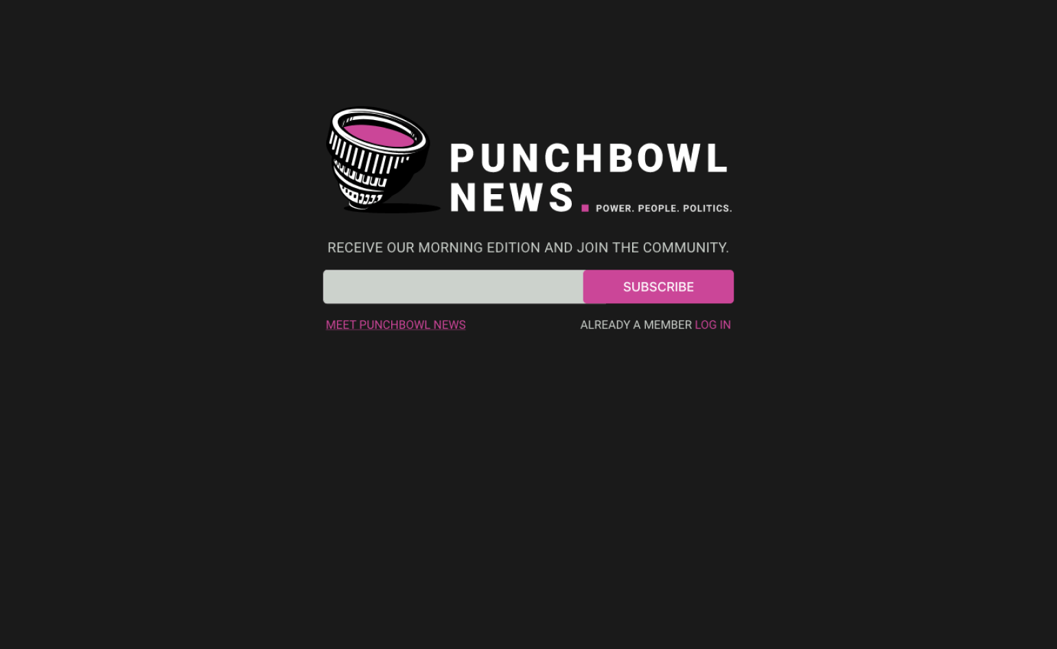
Previous homepage design
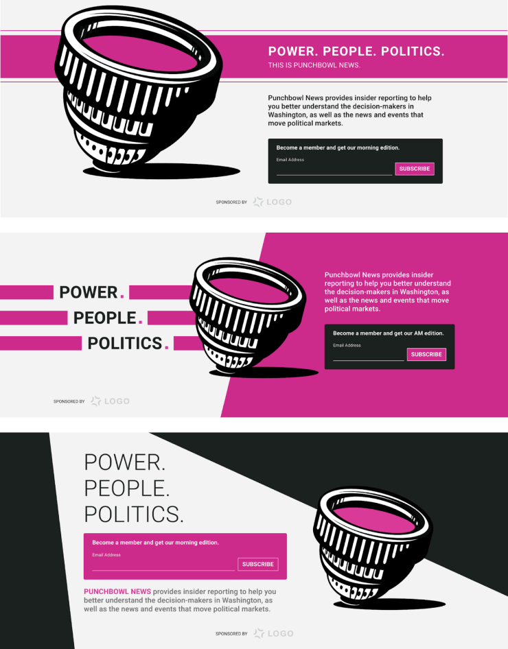
Post-workshop hero iterations
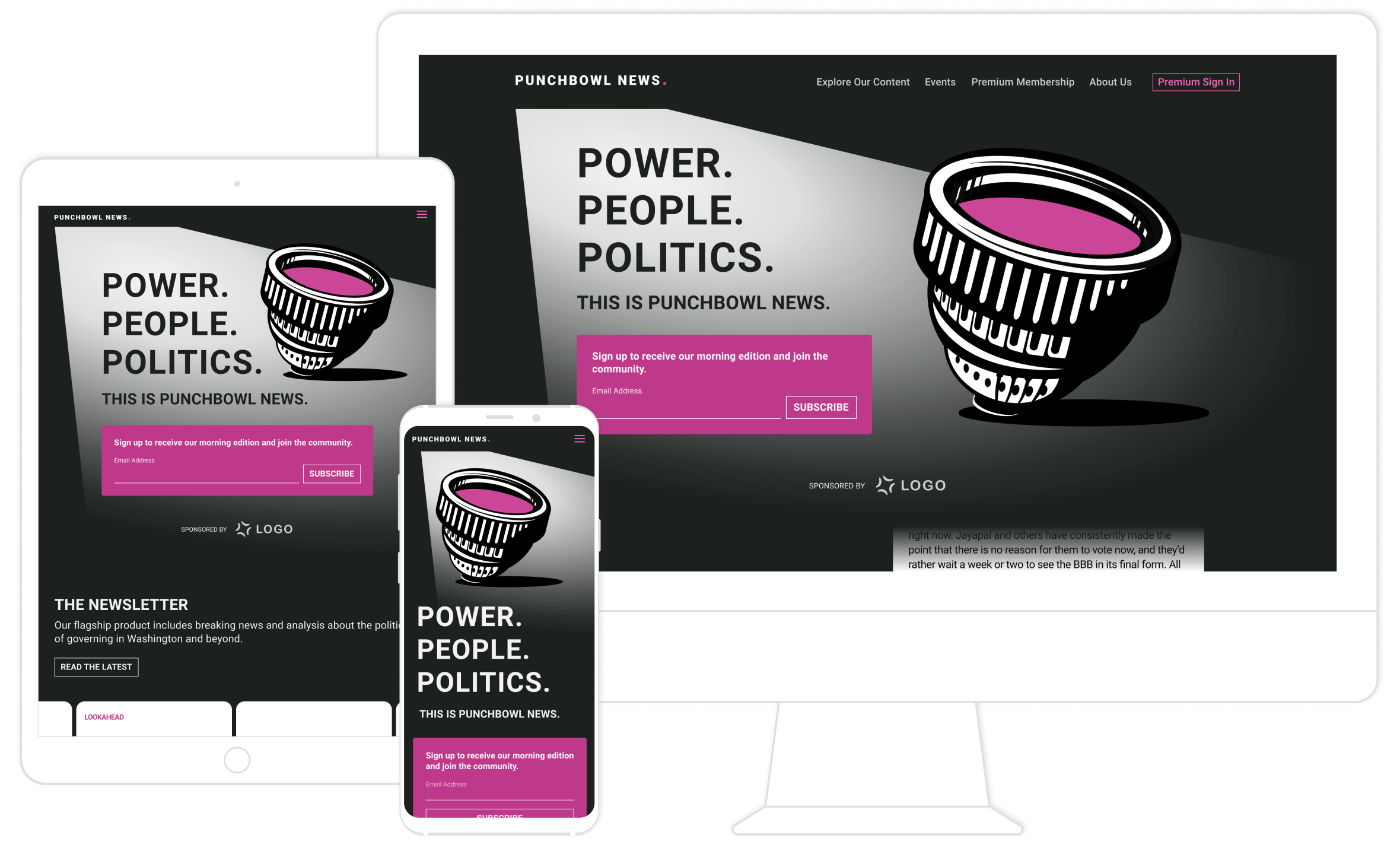
Final homepage hero design
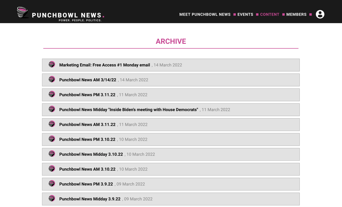
Previous Archive page
Previous Archive page
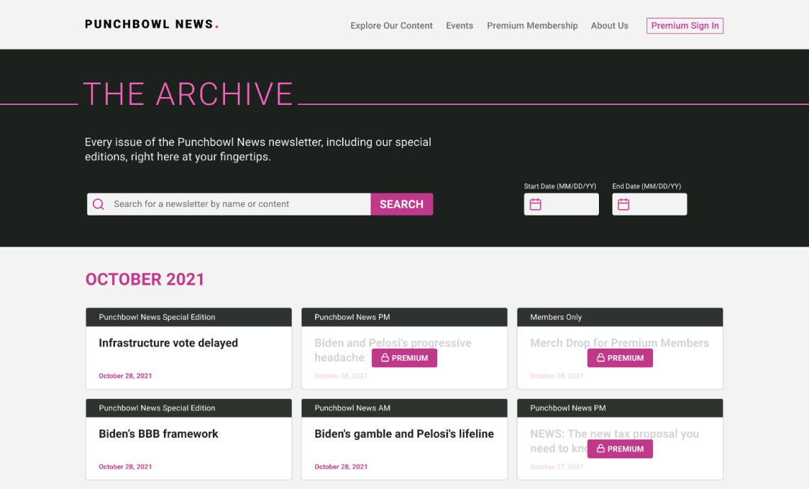
Redesigned Archive
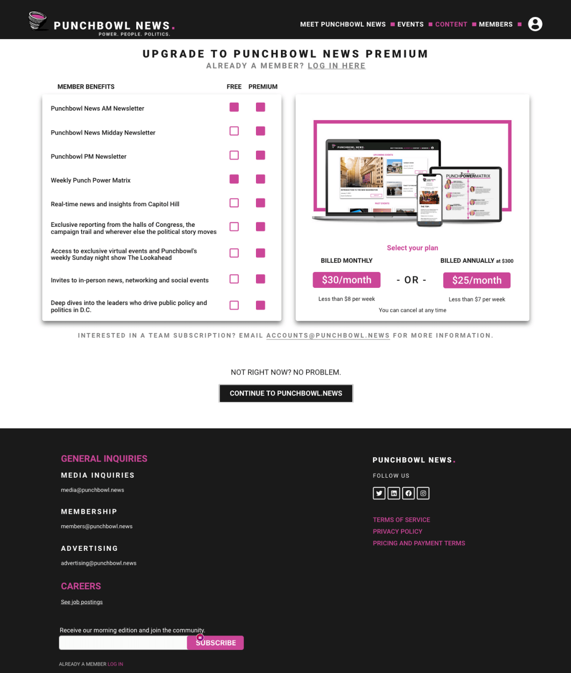
Previous upsell page
Previous upsell page
Previous upsell page
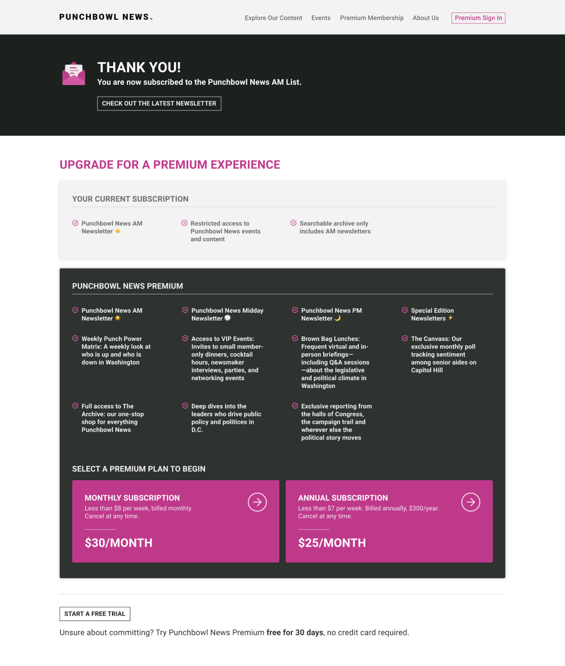
Redesigned upsell page
Designing for Uncertainty
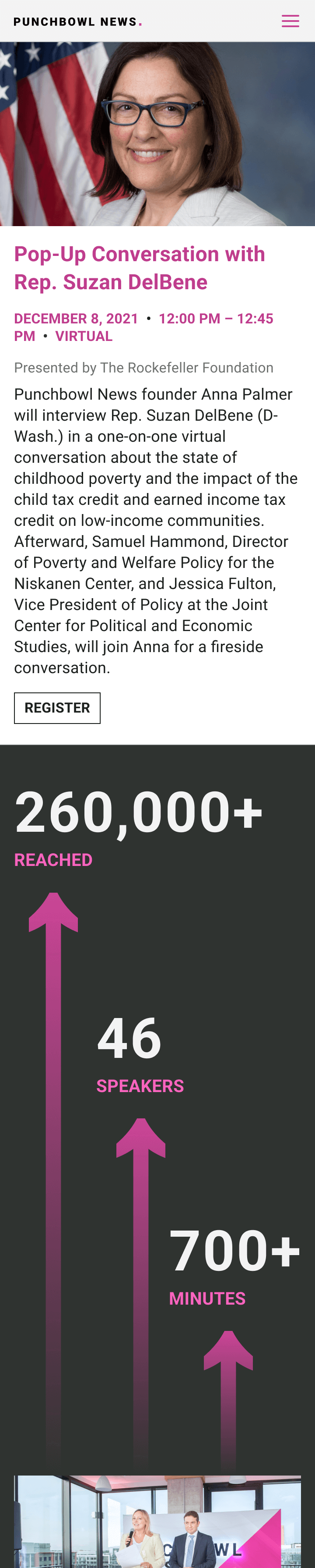
The new design system I established for the initial launch of Punchbowl News’ website was further utilized and expanded upon during a follow-up track of work: a set of new pages for an upcoming event series titled, The Punch Up. Updates, photographs, and editorial content was to be intermittently published as the event series progressed, but we were given only one month prior to its launch to start and finish the design & development of these pages.
This required a lot of advanced content planning, so that with each content update the site still looked and functioned properly long after our engagement with the client ended. Designing for content that didn't exist yet meant that it was essential for these pages to be created in a flexible and adaptable way.
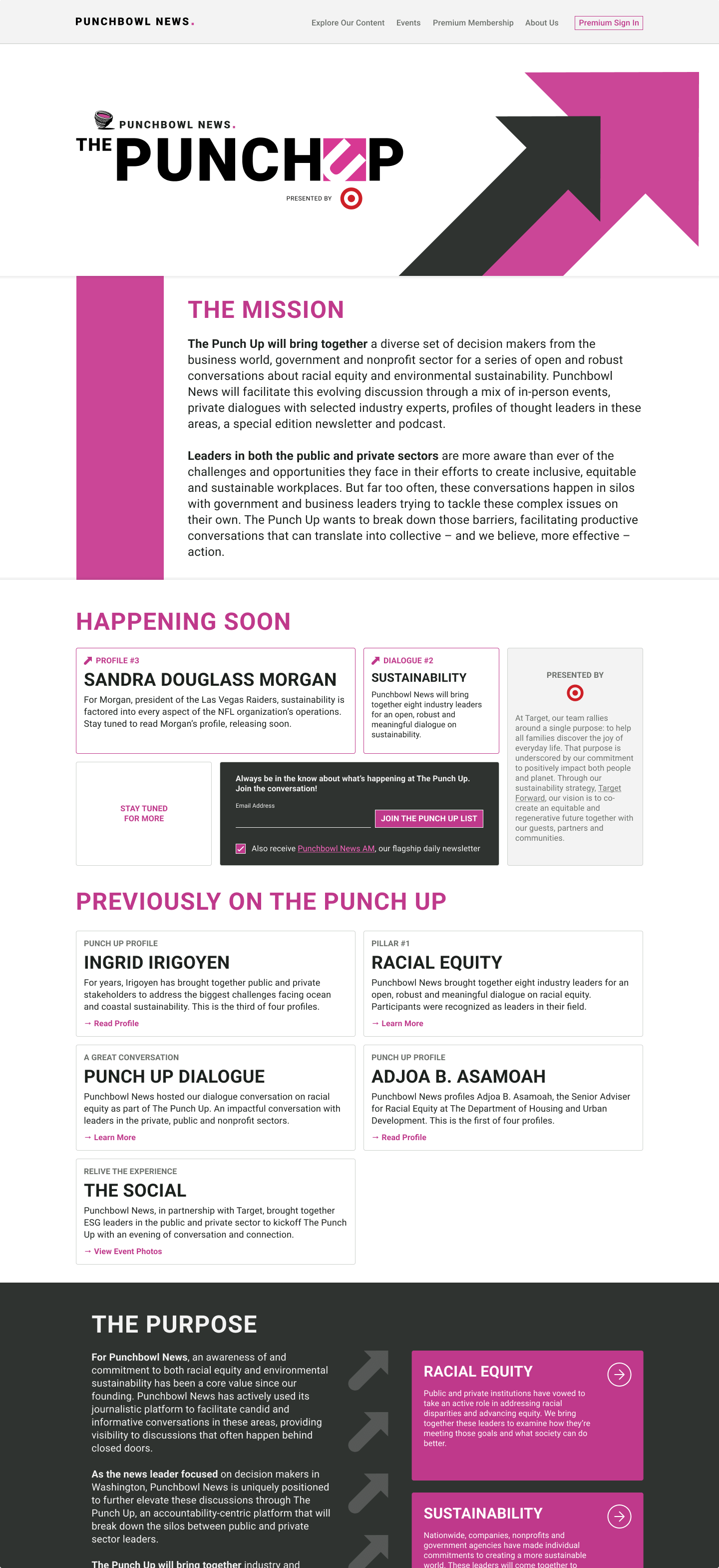
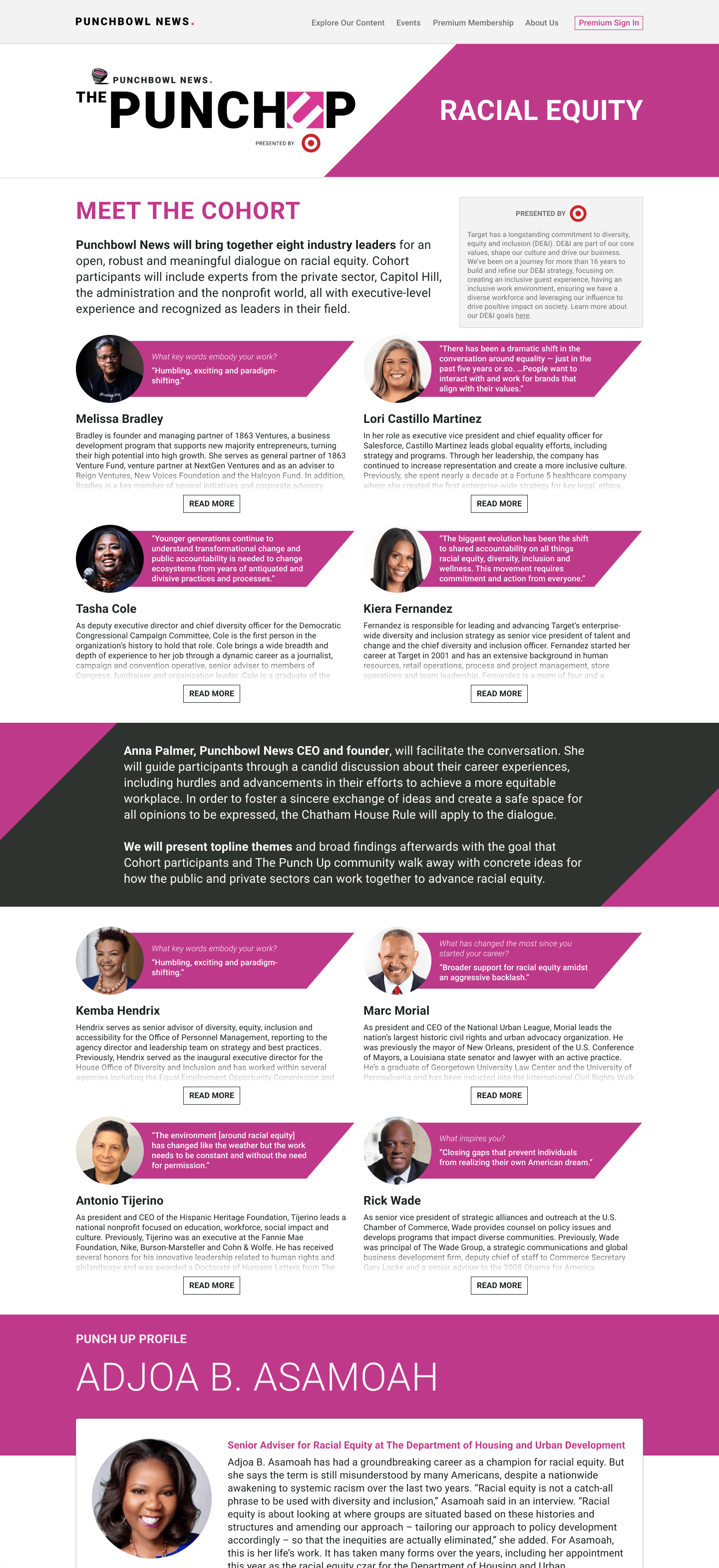
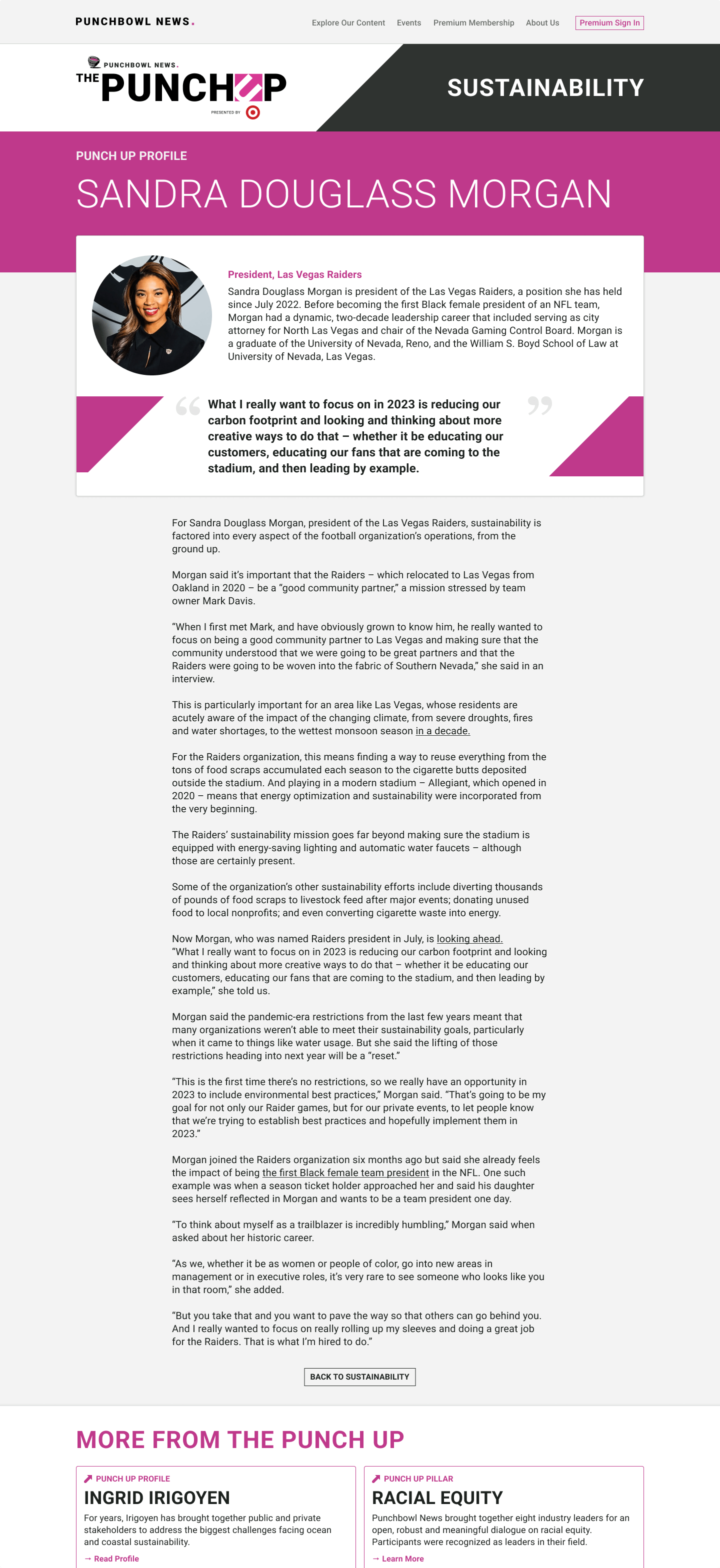
The Punch Up landing page, pillar page, and profile page
Results
- 81% of annual paid subscribers stayed active into their second year, over 40% higher than typical retention rates.
- Increased revenue opportunities for the client through the introduction of website sponsorships.
- A new, comprehensive design system to serve Punchbowl News through future website updates.
From Postlight's Head of Product Management – “[Isar] delivered a homepage that feels exciting and unique and the client was literally giddy.”
From Postlight's Senior Product Manager – “[Isar] has been the guardian of quality and gone above and beyond to ensure a great product.”
© Isar Chang 2025