Nasdaq Careers
Modernizing Nasdaq's most visible recruiting tool in order to improve their talent pipeline, through a design system update and content overhaul
Modernizing Nasdaq's most visible recruiting tool in order to improve their talent pipeline, through a design system update and content overhaul
Modernizing Nasdaq's most visible recruiting tool in order to improve their talent pipeline, through a design system update and content overhaul
Modernizing Nasdaq's most visible recruiting tool in order to improve their talent pipeline, through a design system update and content overhaul
Modernizing Nasdaq's most visible recruiting tool in order to improve their talent pipeline, through a design system update and content overhaul

Overview
Nasdaq Careers was one of four different tracks of work I contributed to as part of Nasdaq’s larger website modernization effort with Postlight. The goal of this particular project was to redesign a set of pages under the About section of nasdaq.com, which is under the purview of Nasdaq’s Talent Attraction & Employer Brand team. As an organization, Nasdaq wanted their web presence to more accurately reflect who they see themselves as today—not just as a stock exchange, but as a global technology company with a strong focus on people.
Naturally, in order to attract the best talent possible, Nasdaq’s About pages also needed to better communicate who they are as a company. The previous designs were visually dull, littered with redundant or irrelevant information, and ineffective in funneling candidates toward Nasdaq’s job boards. At that point in time, the new Nasdaq design system (which Postlight helped create) had only been applied to the redesign of various product and marketing pages so far. With the deep familiarity I had already gained of the design system through previous tracks of work, I was able to execute designs for a whole new page type alongside completely rethinking the content strategy for these pages.
MY ROLE
UX, UI, content strategy
PROJECT TEAMMATES
Product Manager
3 Engineers
DESIGN TIMELINE
1.5 months
Laying the Groundwork
Initially, the project was described as purely a design update requiring us to utilize the exact same content as what we were presented with. However, during our team's first conversation with the project's key stakeholders, we quickly learned that they were interested in overhauling content in addition to design. Though this unexpectedly increased the workload of a project that already had a short timeline, our ability to inform the content of these pages ultimately led to a much more cohesive final result.
In addition to running stakeholder interviews and doing a competitive analysis during this first phase of work, I also did an audit of the existing design and content to identify opportunities to condense and streamline. As a result of this, I was actually able to eliminate an entire existing page from scope due to its redundancy, giving us some time back to really hone in on the remaining four pages:
- Careers
- Diversity, Equity, and Culture
- Our People
- Nasdaq Futures Internship Program
I began with a content blocking exercise, making recommendations on which content was worth keeping, which we could remove, what needed to be moved to a different page, and new content additions that could make the page even better. Since the design system was already well-established, I was also able to provide visual references via quick layouts I put together using existing components in order to aid our team's discussions with the client.
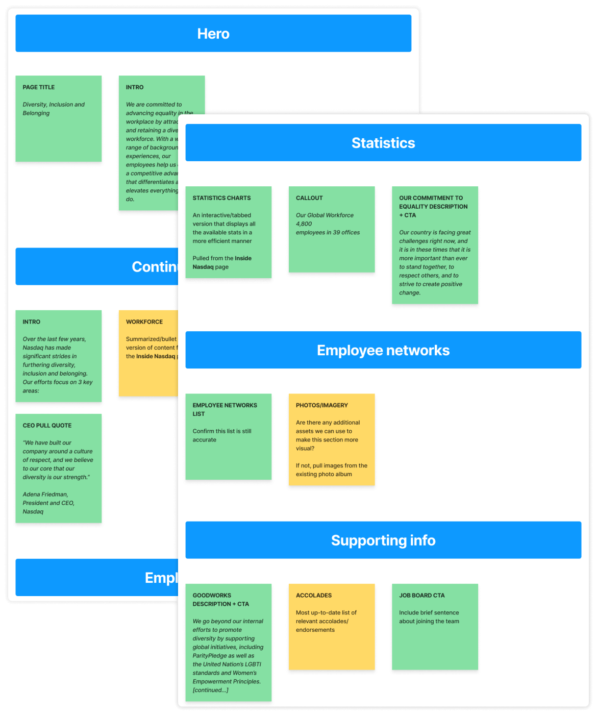
Content blocking for a page that came to be titled Diversity, Equity, and Culture. Green sticky notes indicated existing content, and yellow sticky notes were my recommendations for new content.
Rough layout blocking using existing components, with placeholder colors and imagery left unchanged—but some existing content slotted in, to start giving a sense of what this looks like in practice.
The Final Designs
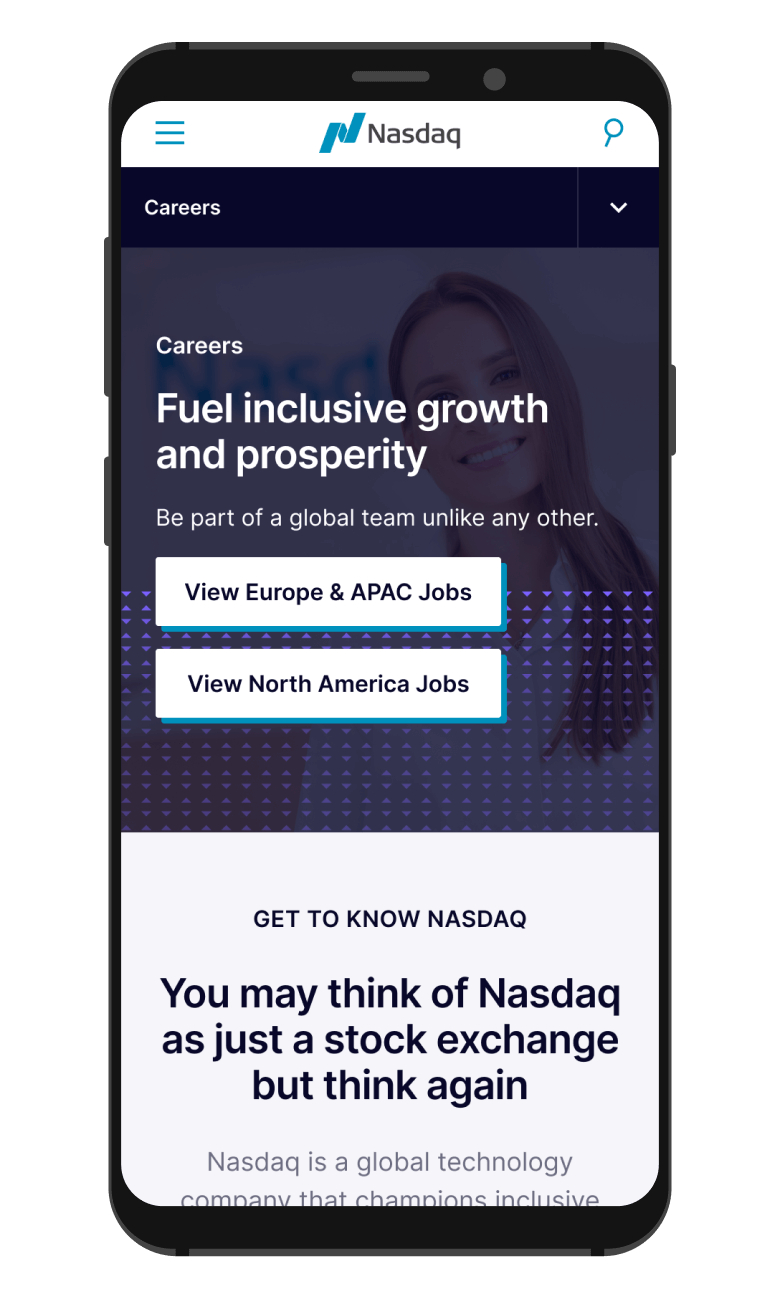
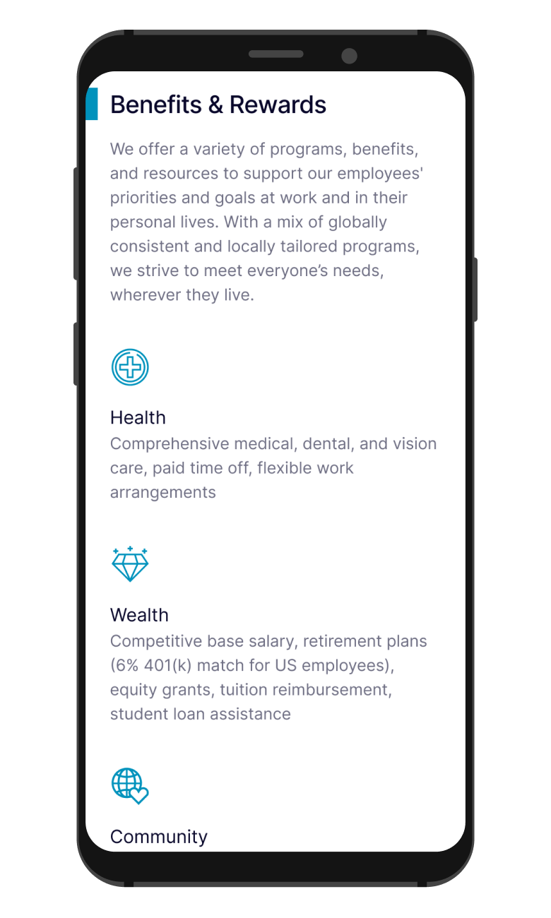
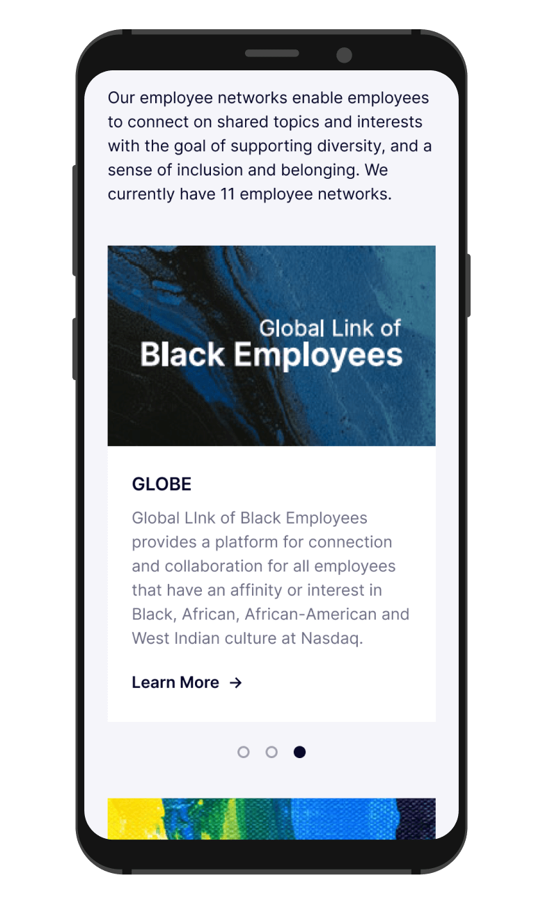
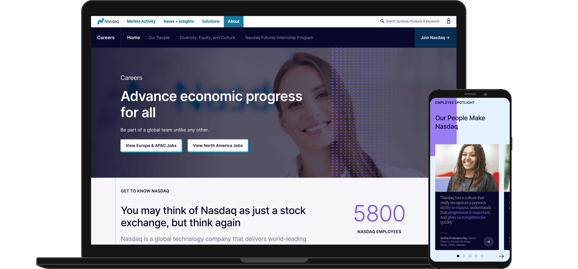
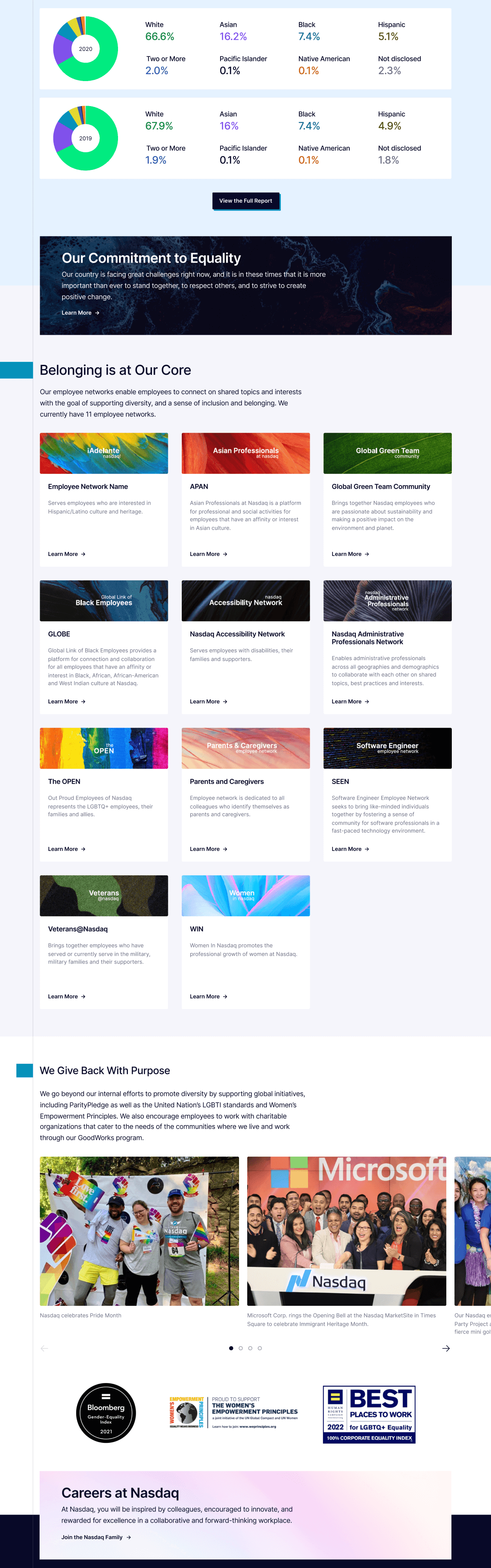
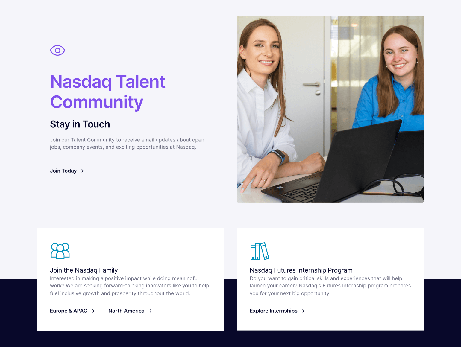
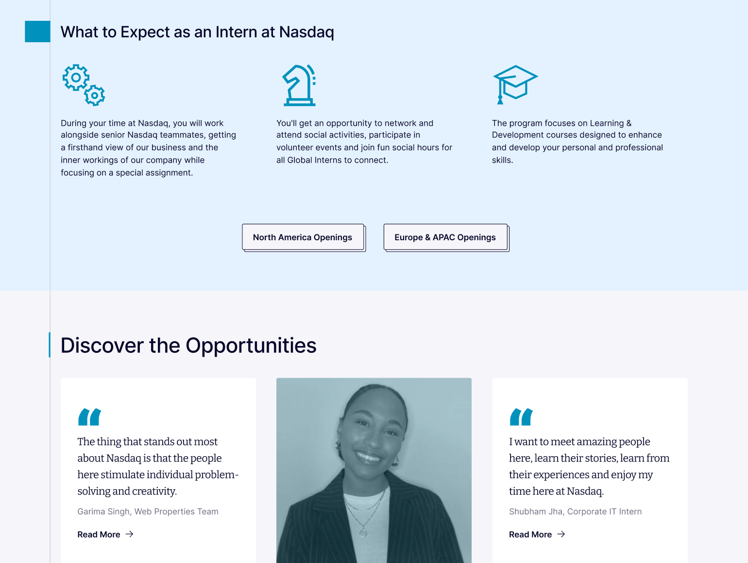
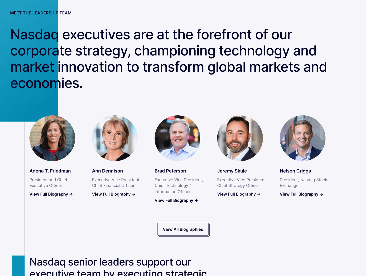
Building off of the initial blocking, I incorporated as much real content as I could while designing. One particular request that the client came back to repeatedly was placing a clear emphasis on their people within the new designs. As a result, these pages feature a generous use of photographic portraits, with plenty of highlights directing the user toward profiles of current employees, past interns recounting their experiences, and even pull quotes from the CEO.
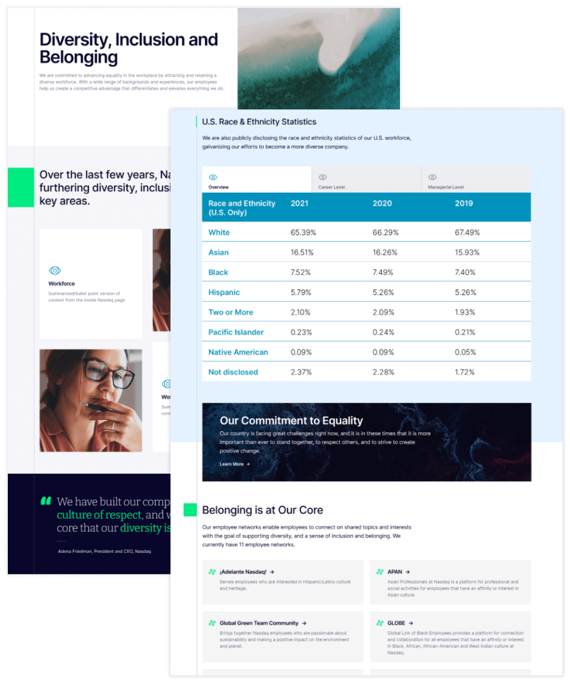
In order for users to find relevant information as quickly as possible, the final layouts of each page were optimized to be as easily scannable as possible. As one example, dense tables containing multiple rows of data set in tiny text were replaced with easy-to-read charts, with any extraneous information also removed to keep things succinct.
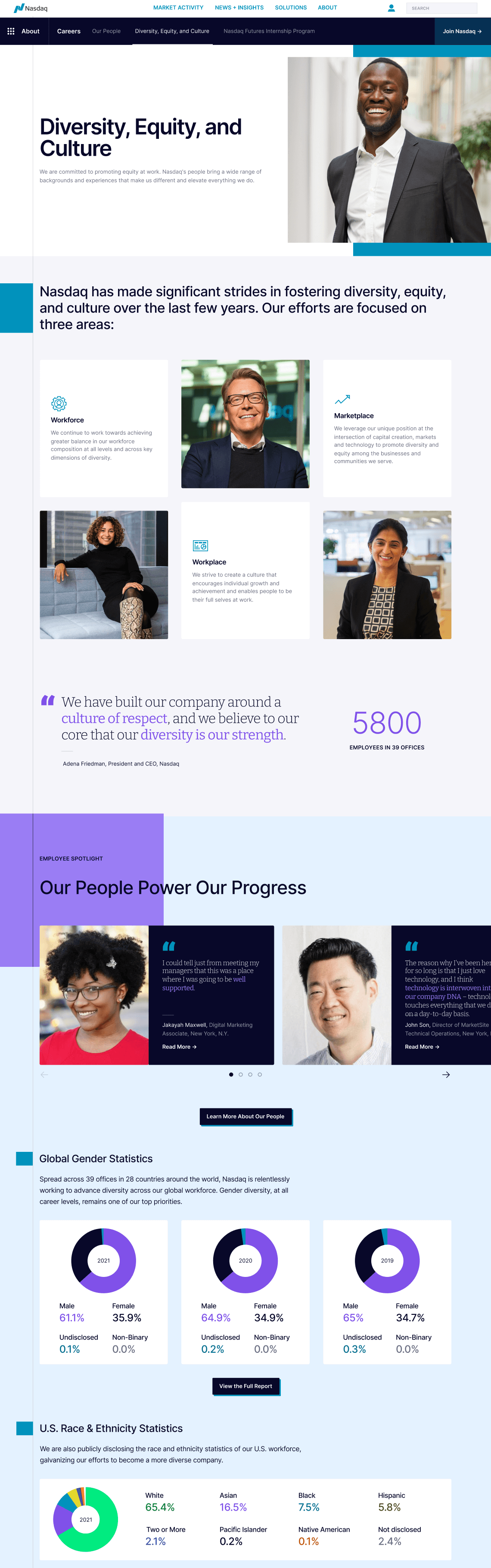
The new design for Diversity, Equity, and Culture
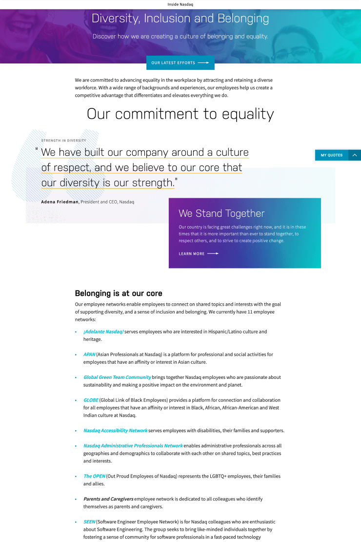
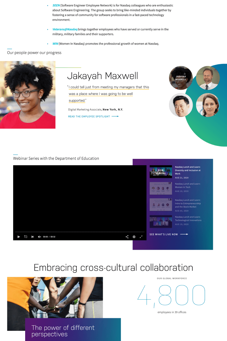
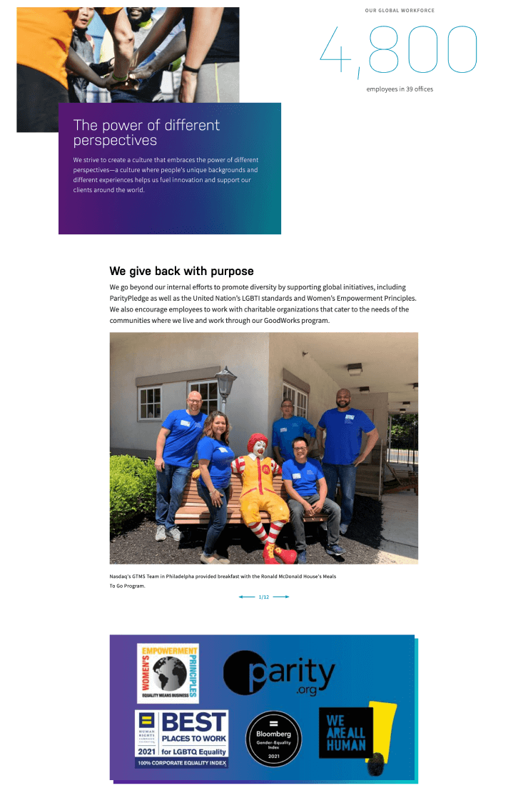
Previous design for the same page—then known as Diversity, Inclusion and Belonging
Additionally, CTAs originally set as easily missable text links were replaced with highly visible buttons and visually engaging prompts, placed strategically throughout the page to encourage clickthrough—particularly the CTAs leading to Nasdaq’s job boards and Talent Community, but also to sister pages and other notable areas of the Nasdaq website.
Careful attention was also paid toward accessibility improvements across all pages, including the implementation of proper color contrast according to WCAG standards, and swapping out instances of images with embedded text for live text.
Collaborating with Engineers
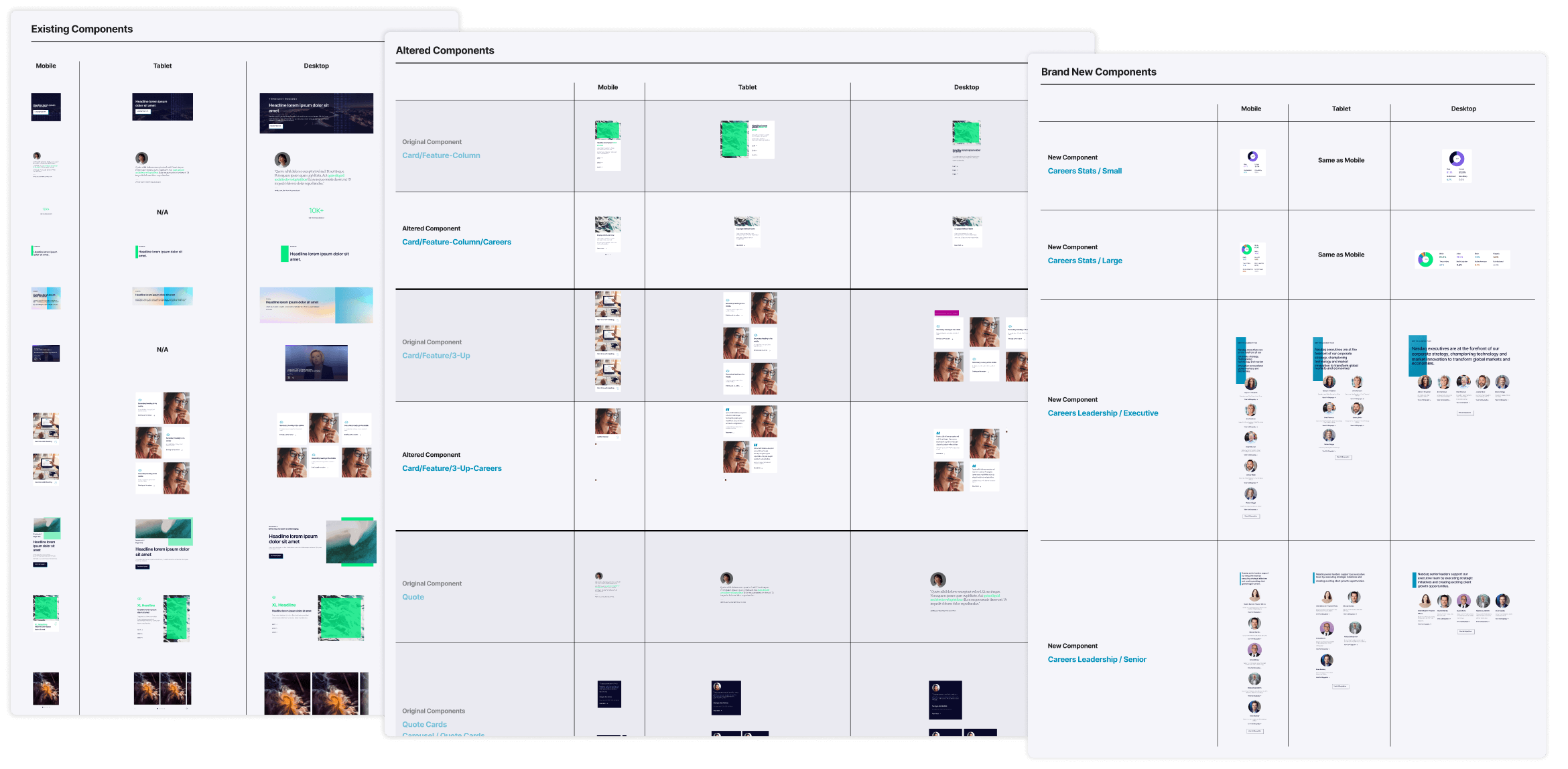
Due to the limited resources and tight timeline given for this project, there was a hard cap on the number of new components that could be added to the design system for use on these pages. A good portion of the design process involved working with our engineers so that we could achieve what the design needed without exceeding this component limit. The solution? Alter existing components enough to make the designs feel bespoke and address the client’s needs, while maintaining enough of its integrity that it wouldn’t require the dev lift of a brand new component.
I also had multiple conversations with our engineers to ensure that every component alteration as well as every net-new component was actually feasible—it was imperative that our work was compatible with work being done by another software agency that Nasdaq had employed. Every component I used in the final designs was then documented in a key, which provided engineers an easy way to reference these altered components alongside the original components they were based on. After handoff, I continued working with our engineers as well as the design team at Nasdaq to get these across the finish line.
Results
- +485% conversion rate for job applications in the first month of launch—the clickthrough rate for CTAs to view the job boards or join Nasdaq’s Talent Community went from 1.7% pre-launch, to 8.2% post-launch.
- Earned praise from Nasdaq's Board of Directors as well as Nasdaq’s Chief Strategy Officer, with the new pages described as “world class” and “stunning”.
- Brings Nasdaq one step closer to the finish line in the ongoing redesign of nasdaq.com, and sets the stage for the redesign of the remainder of Nasdaq’s About section.
- From Postlight's Senior Product Manager – “Her work on Nasdaq shows her proficiency in using design systems and using them to build out new user experiences. [...] She was mentioned specifically by the core Nasdaq stakeholders as a “need to retain” member of the Postlight team.”
© Isar Chang 2023