Alyvant
Enabling healthcare sales forces to manage the entire cycle of engagement through an intuitive and dynamic mobile application perfectly tailored to their needs.
Modernizing Nasdaq's most visible recruiting tool in order to improve their talent pipeline, through a design system update and content overhaul
Modernizing Nasdaq's most visible recruiting tool in order to improve their talent pipeline, through a design system update and content overhaul
Modernizing Nasdaq's most visible recruiting tool in order to improve their talent pipeline, through a design system update and content overhaul
Modernizing Nasdaq's most visible recruiting tool in order to improve their talent pipeline, through a design system update and content overhaul

Overview
Traditionally, healthcare sales personnel face an uphill battle when it comes to streamlining their everyday job responsibilities. Assembling a call plan, information gathering, planning their travel route, call logging—all of these are often highly manual processes that take up a significant amount of time or force them to use convoluted, outdated tools. Pharmaceutical company Alyvant wanted to build a proprietary tool that vastly improved the workflow of their sales reps, while also leveraging the data and analytics at Alyvant’s disposal.
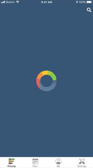
The result of our engagement? An AI-powered iOS app that surfaces a prioritized list of healthcare providers (HCPs) accompanied by valuable provider information, with thoughtfully designed features minimizing the admin work required of a sales rep, so that they can focus the bulk of their efforts on the actual sale.
MY ROLE
User research, UX, UI, product strategy, usability testing
PROJECT TEAMMATES
Product Manager
Creative Director
Designer
2 iOS Developers
DESIGN TIMELINE
~1 year
Initial UX & Discovery
We began the project with discovery: a process during which we conducted user research, defined the user problem, explored possible solutions, and created high fidelity wireframes representing the UX work we’d done. This involved the whole team—not just the design department—to ensure that the concepts we came up with were feasible for development. We also used this process to scope the project and establish a product vision, maintaining regular check-ins with the client to ensure everyone was in agreement about overall product strategy.
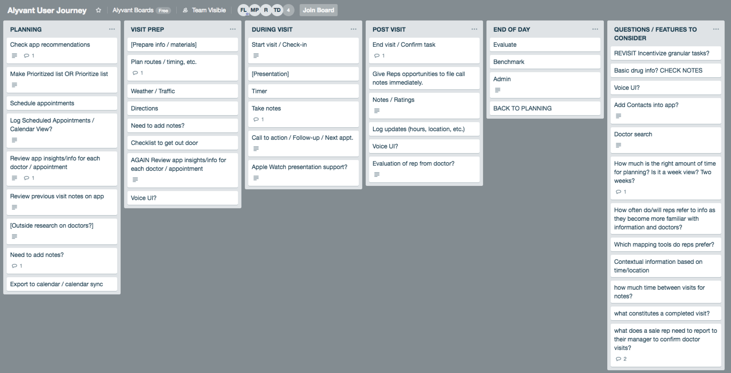
User research involved numerous interviews with stakeholders (several who had deep experience in the pharmaceutical industry) as well as current and former sales reps. We also interviewed physicians to get insight into strategies for reducing friction during a sales call and increasing overall success. Our learnings informed the app’s eventual user journey, feature ideation, and key success criteria, all while incorporating Alyvant’s data-informed and patient-centric vision.
User research involved numerous interviews with current and former sales reps as well as key stakeholders (several who had deep experience in the pharmaceutical industry). We also interviewed physicians to get insight into strategies for reducing friction during a sales call and increasing overall success. Our learnings informed the app’s eventual user journey, feature ideation, and key success criteria, all while incorporating Alyvant’s data-informed and patient-centric vision.
Early iterations of the priority list used a decile value rather than colors, and showed the number of physicians nearby on an individual basis.
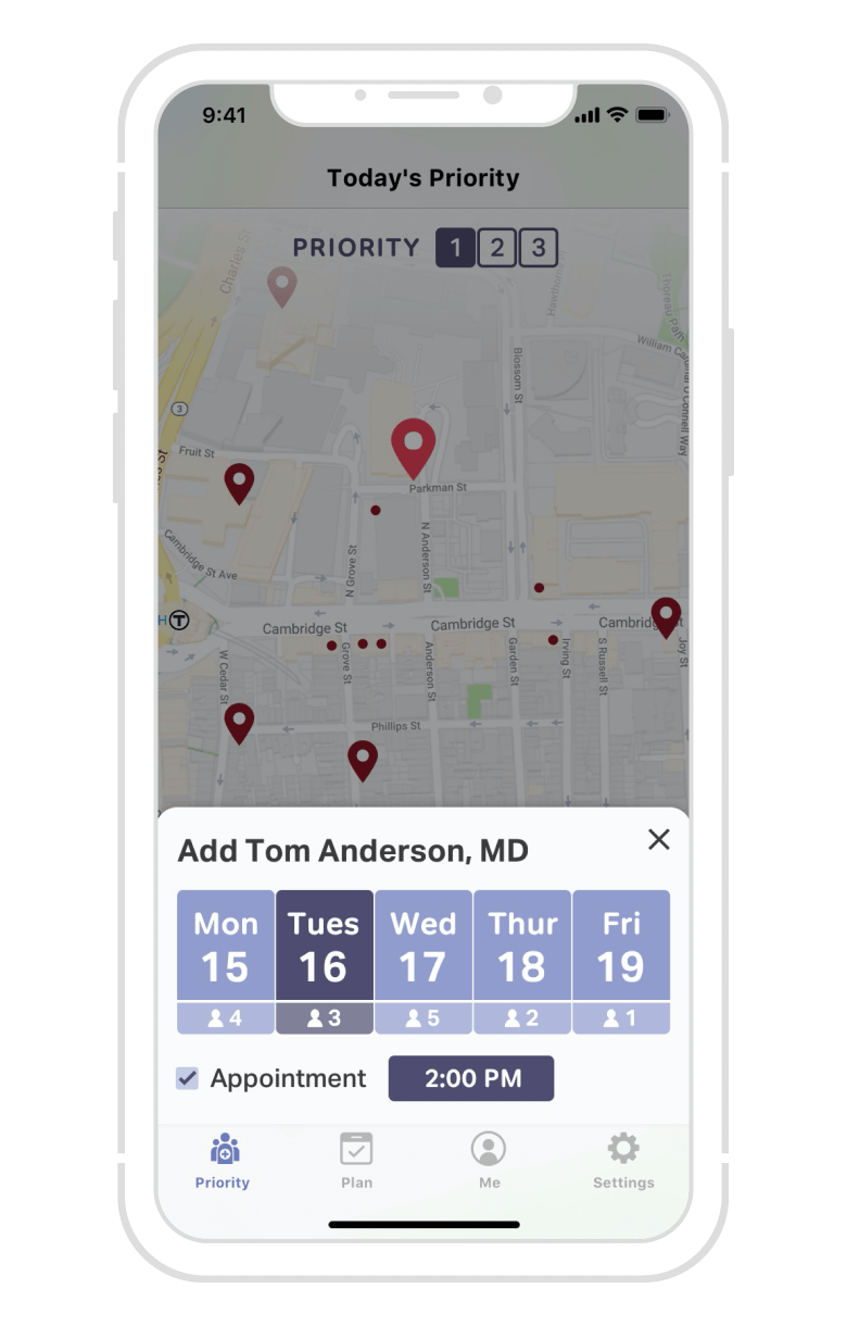
Before Add to Plan became a much more robust view, we envisioned adding a physician to a sales rep’s plan from directly within the map.
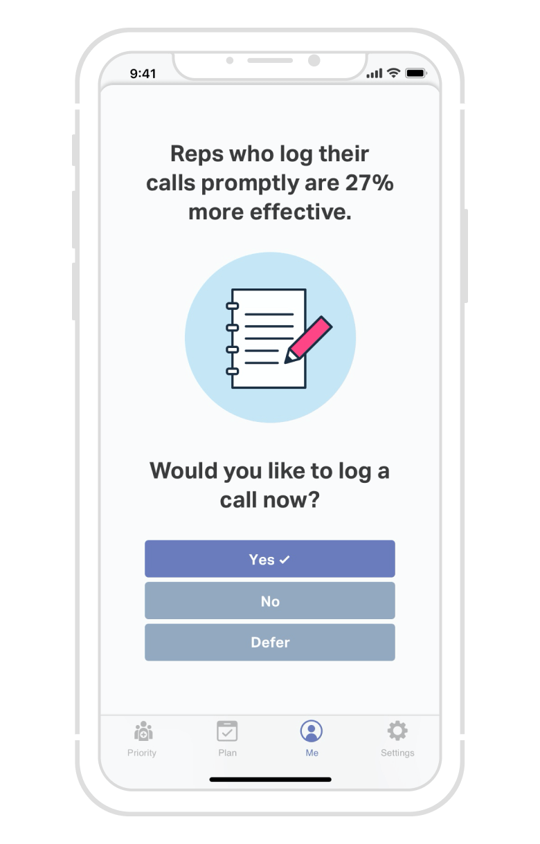
Periodic prompts to log calls were ultimately never implemented for the best possible reason—reps were already logging calls regularly without them!
Data-Powered Decision Making
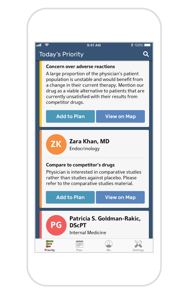
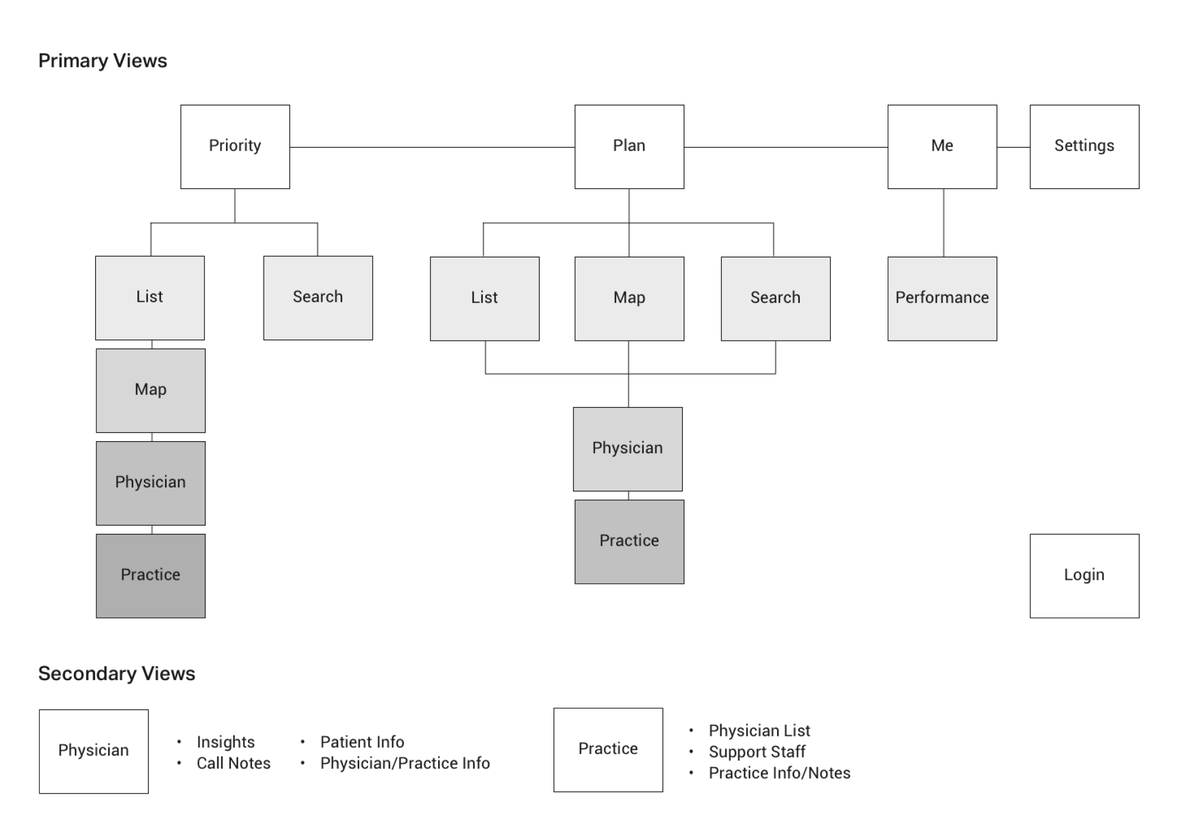
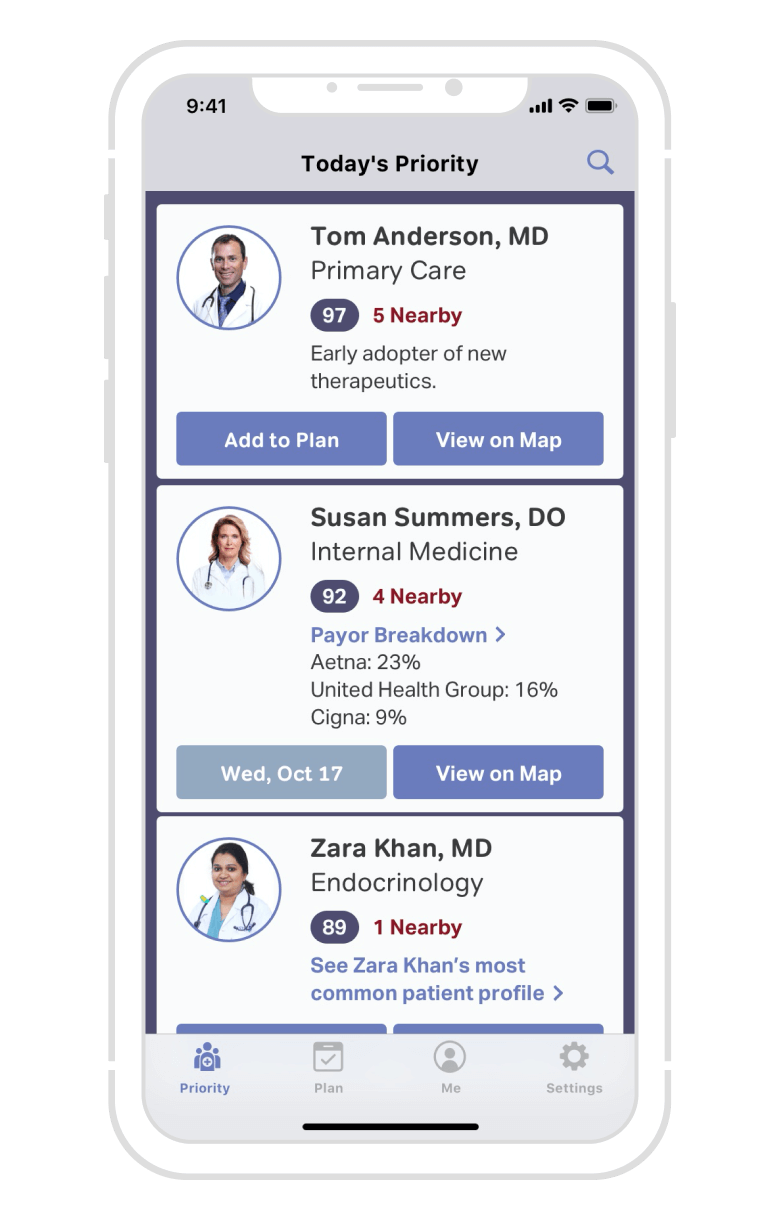
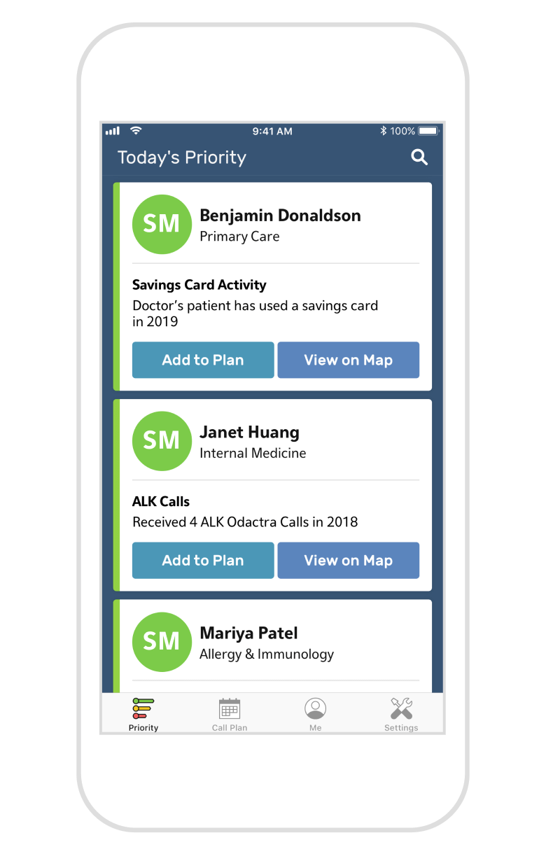
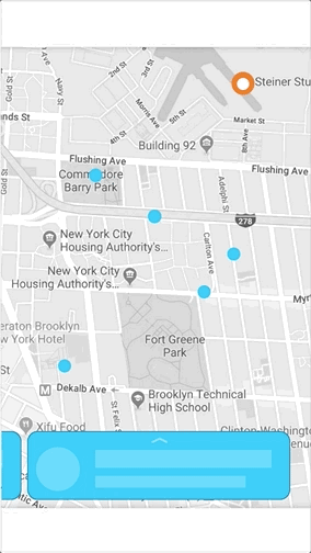
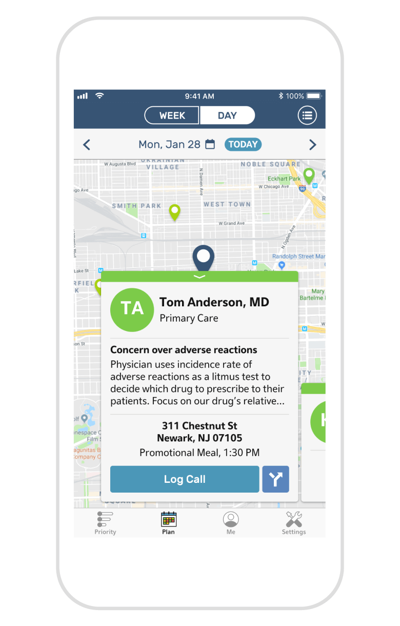
The primary view of this app contains a prioritized list of providers, which Alyvant can dynamically reprioritize based on key information (such as insurance claims) as well as the sales rep’s existing call history. Priority level is immediately identifiable through color gradation, with green being the highest priority (therefore the highest value visit) and red being the lowest priority.
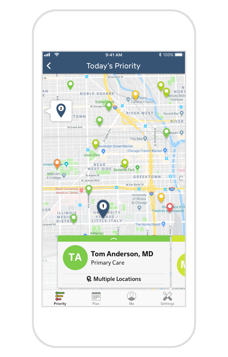
A “top insight” displayed alongside each provider further aids the sales rep, ensuring a meaningful and productive conversation with the physician during their call. Reps can also view this list within a map, allowing them to easily view their proximity to a provider as they assemble their call plan.
Considerations and Challenges
PROBLEM
PROBLEM
The original method of indicating priority using numerical decile values turned out to be a bit confusing and not easily scannable, so we switched to using color instead. But a new problem emerged—which color should we use for high priority versus low priority?
SOLUTION
Multiple discussions were held about color psychology to determine the most suitable color palette, and I even ran informal surveys around the office. While I initially thought to use red for high priority to invoke a sense of urgency, the client wanted to tie high priority physicians to a sense of achievement rather than alarm, so the highest priority was made to be green instead.
PROBLEM
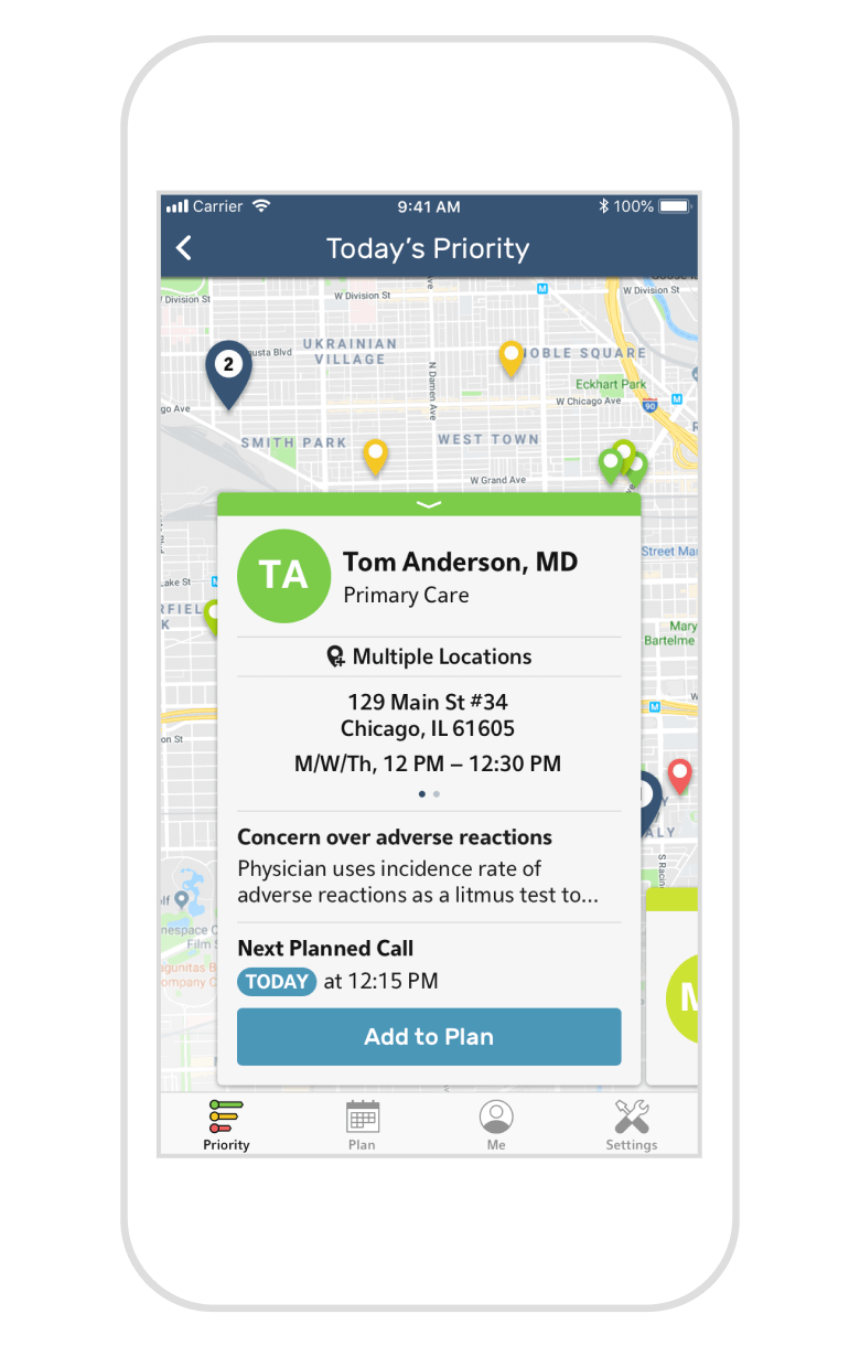
Sales reps told us of their frustrations with showing up to a physician's office only to realize they were at the wrong location. It was imperative that the existence of multiple locations was clearly indicated, whether a rep was browsing their priority list or planning their route on the map.
SOLUTION
To make viewing a physician with multiple locations on the map view more clear, I added a pop-up bubble letting the user know that a location's pin is not within the viewport, thereby encouraging them to pan over or zoom out. Reps can also swipe through multiple locations within a physician's info card, and the selected pin as well as the map itself will adjust accordingly.
To make viewing a physician with multiple locations on the map view more clear, I added a pop-up bubble letting the user know that a location's pin is not within the viewport, thereby encouraging them to pan over or zoom out. Reps can also swipe through multiple locations within a physician's info card, and the selected pin as well as the map itself will adjust accordingly.
An early interactive prototype to show desired microinteractions.
An early interactive prototype to show desired microinteractions.
Microinteractions demonstrated using close-to-final designs.
Microinteractions demonstrated using close-to-final designs.
The new design for Diversity, Equity, and Culture
Versatile Scheduling and Visual Route Planning
Versatile Scheduling and Visual Route Planning
The other key feature of this app is the ability to schedule calls, do short-term and long-term planning, and easily log calls after their completion. Perhaps surprisingly, reps didn’t want a replacement for Google Calendar or their paper planner, but rather, a way to move seamlessly from the start of their user journey to the end.
Much of my time was spent iterating on how the sales rep navigates between the various different views, as well as how to display them in a way that allows for maximum functionality, but doesn't clutter up or overcomplicate the view.
The other key feature of this app is the ability to schedule calls, do short-term and long-term planning, and easily log calls after their completion. Perhaps surprisingly, reps didn’t want a replacement for Google Calendar or their paper planner, but rather, a way to move seamlessly from the start of their user journey to the end.
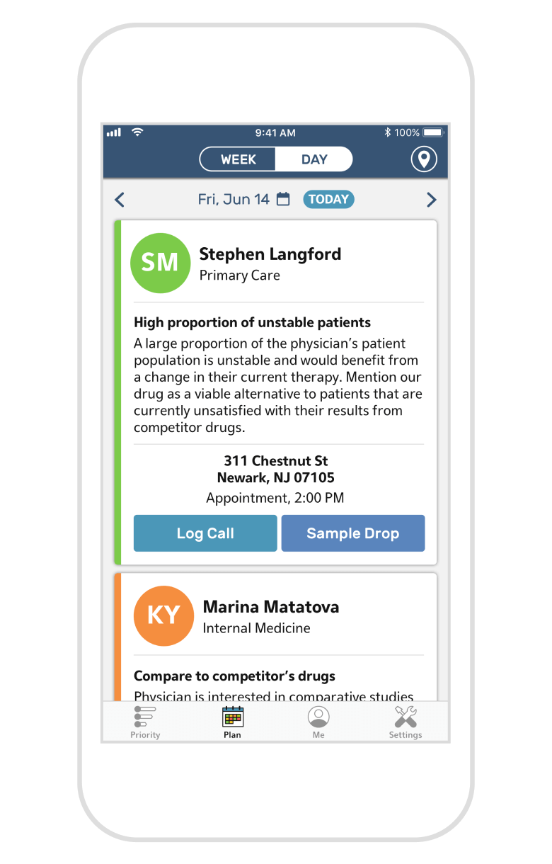
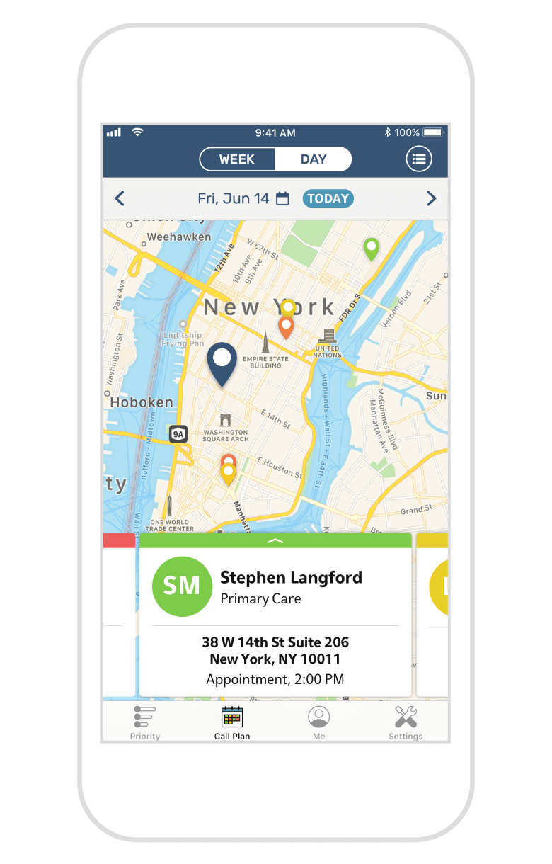
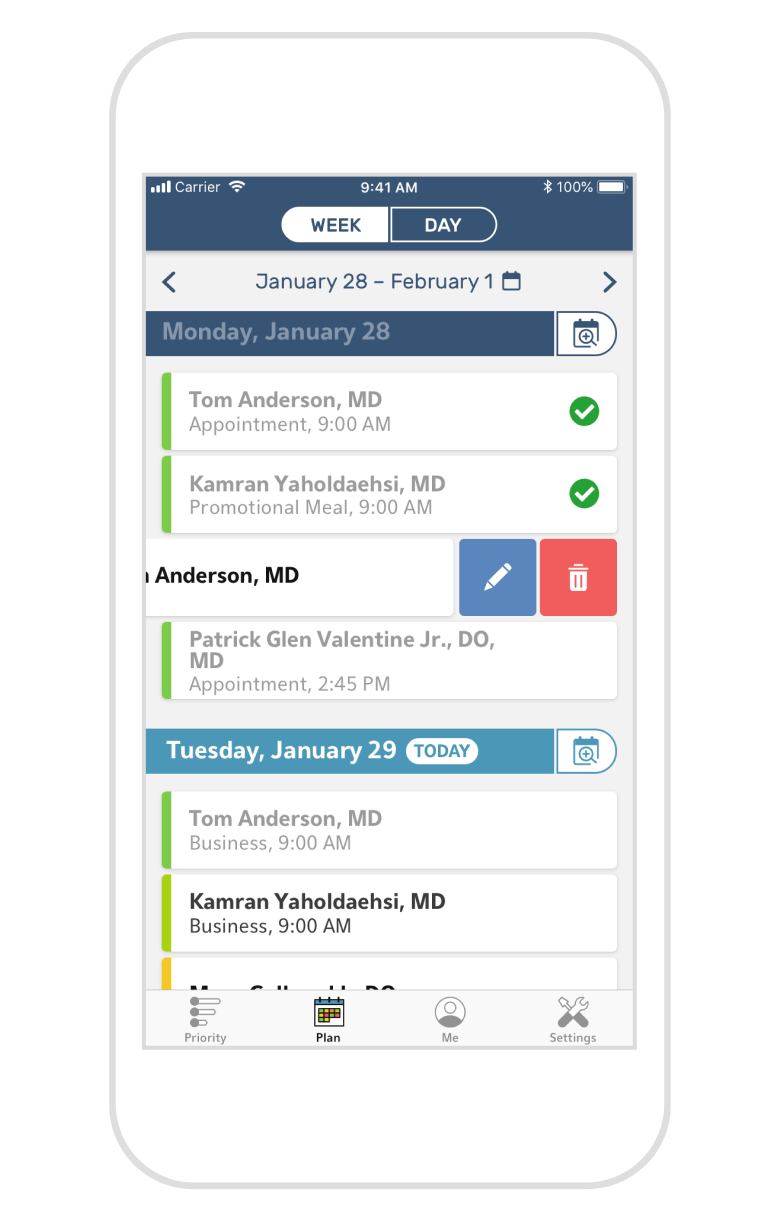
The Plan tab lets reps easily view different days of their schedule, and view it by day or by week. They can also see it as a detailed list or within a map.
The Plan tab lets reps easily view different days of their schedule, and view it by day or by week. They can also see it as a detailed list or within a map.
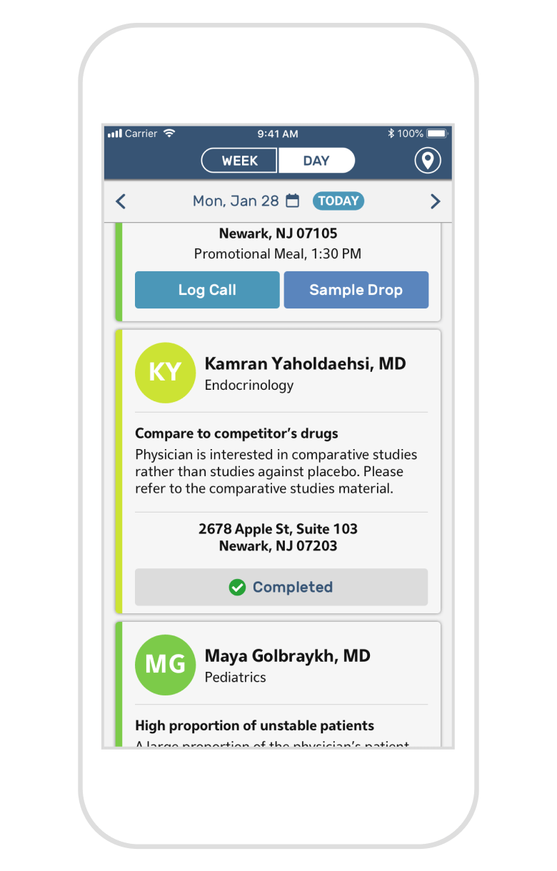
In addition to viewing their schedule, reps can directly log any calls they've finished, or mark that they did a sample drop rather than a formal call.
In addition to viewing their schedule, reps can directly log any calls they've finished, or mark that they did a sample drop rather than a formal call.
If a rep is on the map view, they're likely planning their route, so "Sample Drop" was swapped out for navigation instead, linking them to Google Maps.
In the Plan tab, reps can switch between a detailed day view and an overview of their week, while still seeing relevant provider information and their priority level. For better visualization of travel distance between calls, reps can also view their day plan within a map, and open Google Maps directly from the app (with the address pre-filled) for navigation.
The Week view allows for the drag and drop of each scheduled call as well as handy swipe actions, making any scheduling changes a breeze. Tapping any particular day in the list takes the user back to the detailed view for that day, allowing the rep to seamlessly switch back and forth.
Iterating Based On Emerging Needs
PROBLEM
One of the most time-consuming aspects of a sales rep's day was the act of traveling between calls, so while a physician's priority is the primary driver behind how they plan out their day, the app didn't yet account for adding or logging last minute calls based on location.
SOLUTION
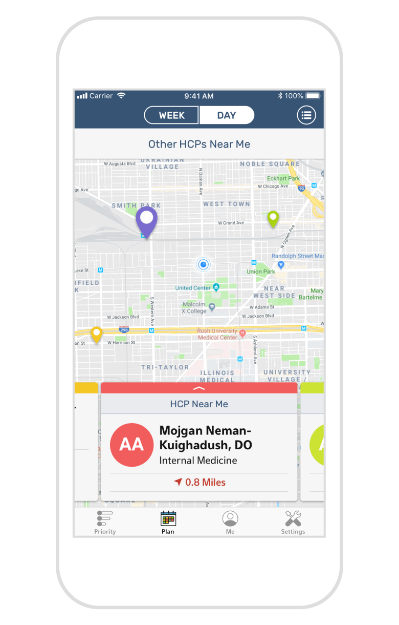
In order to maximize the time spent in a particular neighborhood, sales reps wanted the ability to see physicians near their current location, regardless of a physician's priority level. Integrating this seamlessly into the experience meant surfacing it only where it made sense—when the user was actively on the map view—and visually differentiating them from their usual priority list through color choice and clear labels.
In order to maximize the time spent in a particular neighborhood, sales reps wanted the ability to see physicians near their current location, regardless of a physician's priority level. Integrating this seamlessly into the experience meant surfacing it only where it made sense—when the user was actively on the map view—and visually differentiating them from their usual priority list through color choice and clear labels.
An Informed and Optimized Scheduling Experience
An Informed and Optimized Scheduling Experience
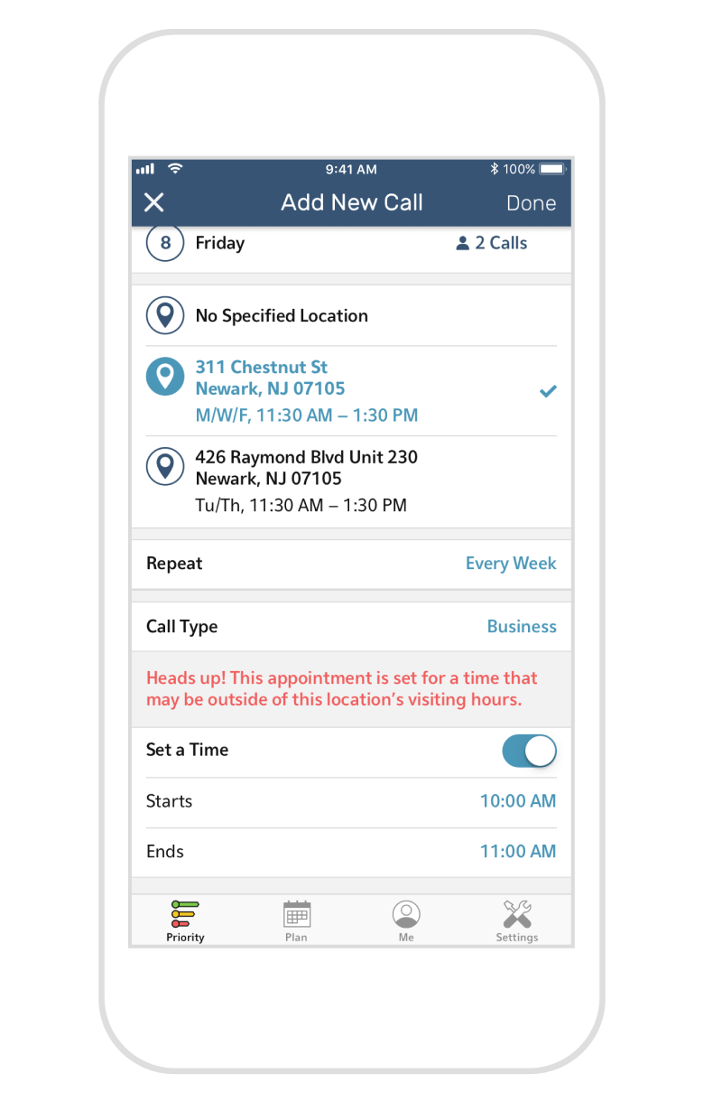
To build out their call plan, sales reps simply select “Add to Plan” on either the list or map view in the Priority tab. To make adding a new call as informed of a decision as possible and reduce the chance for scheduling errors, the app displays any existing calls with a particular physician, as well as how busy each day is by indicating the number of calls scheduled. The app also utilizes existing office information to populate the location field, and notifies the rep should they attempt to schedule an appointment outside of the hours on file.
A new field that wasn't in the initial iteration was added after receiving feedback from sales reps during beta testing: “Call Type”. This allows the rep to set their call as Appointment, Business, Promotional Meal, or Unspecified, which is then reflected back into the Plan tab. As they review their upcoming calls, reps can make preparations as necessary depending on the type of call they're headed to.
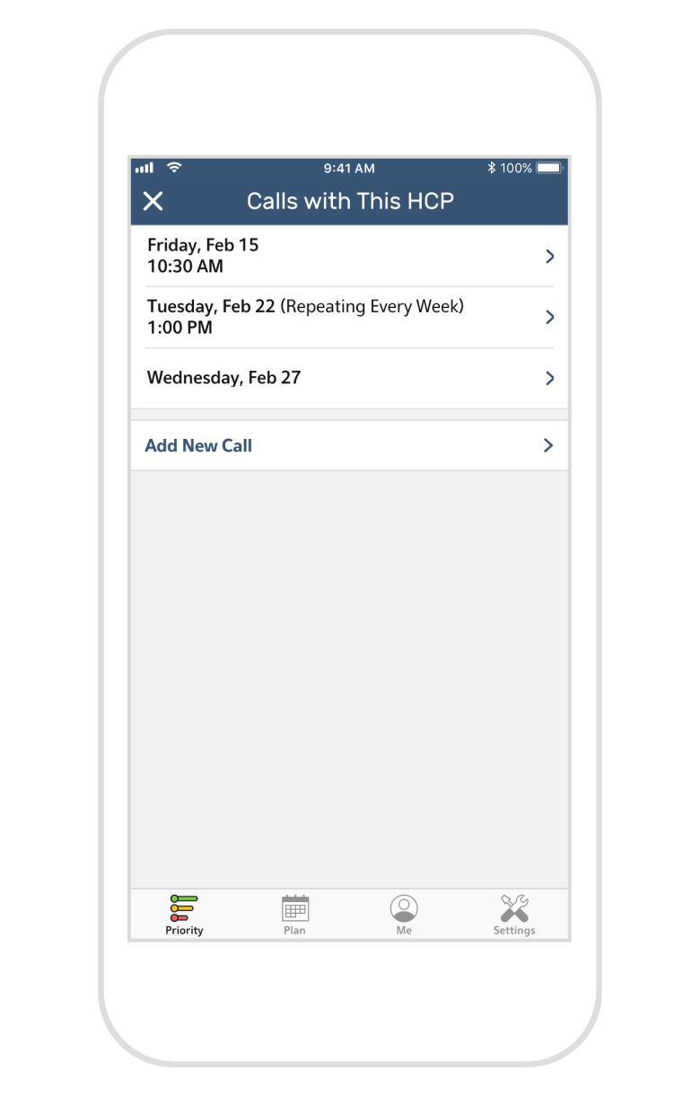
After tapping “Add to Plan”, the rep is taken to this overview screen first to review any previously scheduled calls with the same physician.
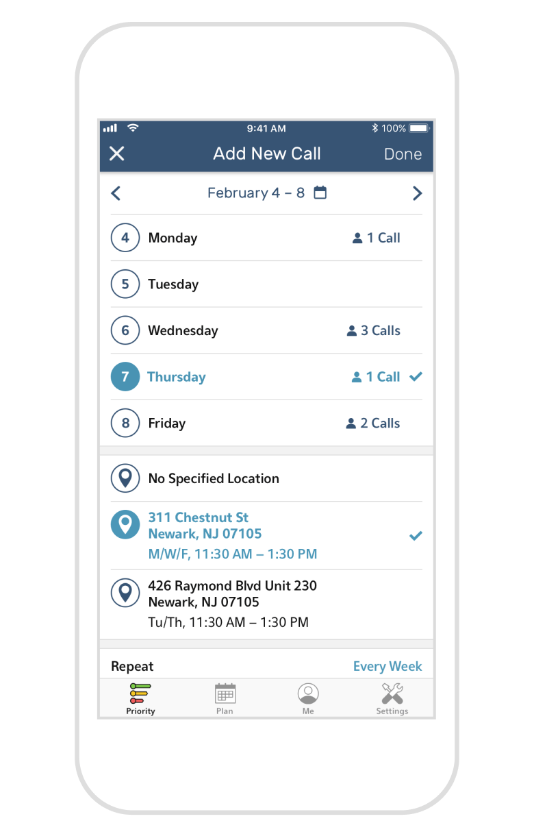
Giving the rep more visibility into their schedule as they add a new call reduces the need for them to cross-reference, simplifying the planning process.
Giving the rep visibility into their schedule as a whole while adding a new call reduces the need to cross-reference, simplifying the planning process.
Features such as time validation shows the power of a dynamic digital tool in terms of its ability to ease the load of a sales rep juggling multiple calls.
Effortless Access to Provider Information
Effortless Access to Provider Information
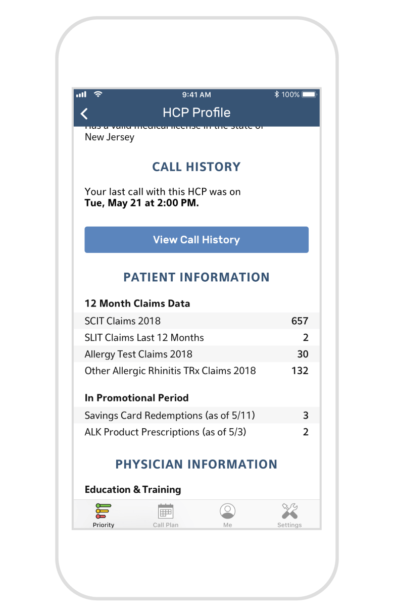
To help facilitate productive and effective conversations with providers, reps can access an HCP’s profile from various points across the app simply by tapping on a card containing their name. The profile is a comprehensive resource that not only automatically surfaces information the sales reps regularly reference (such as contact information and records of their previous calls), but balances this information with key insights and useful data, reducing the planning time needed before a meeting.
Alyvant-generated insights are specific to each HCP and regularly updated as new data comes in. Reps can then give feedback on which insights are the most useful as they continue to build relationships with the providers they visit. This in turn helps train Alyvant's AI to continuously improve the quality of insights being generated for reps.
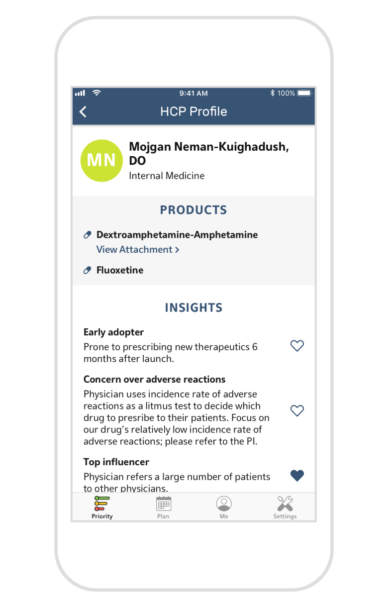
As much as we wanted to use actual head shots as a physician's avatar, we had to switch to initials due to the unreliability of sourcing quality photographs.
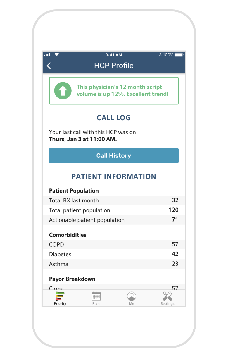
Call History allows the rep to view the date/time of every previous call in addition to the details of the form they complete each time they log those calls.
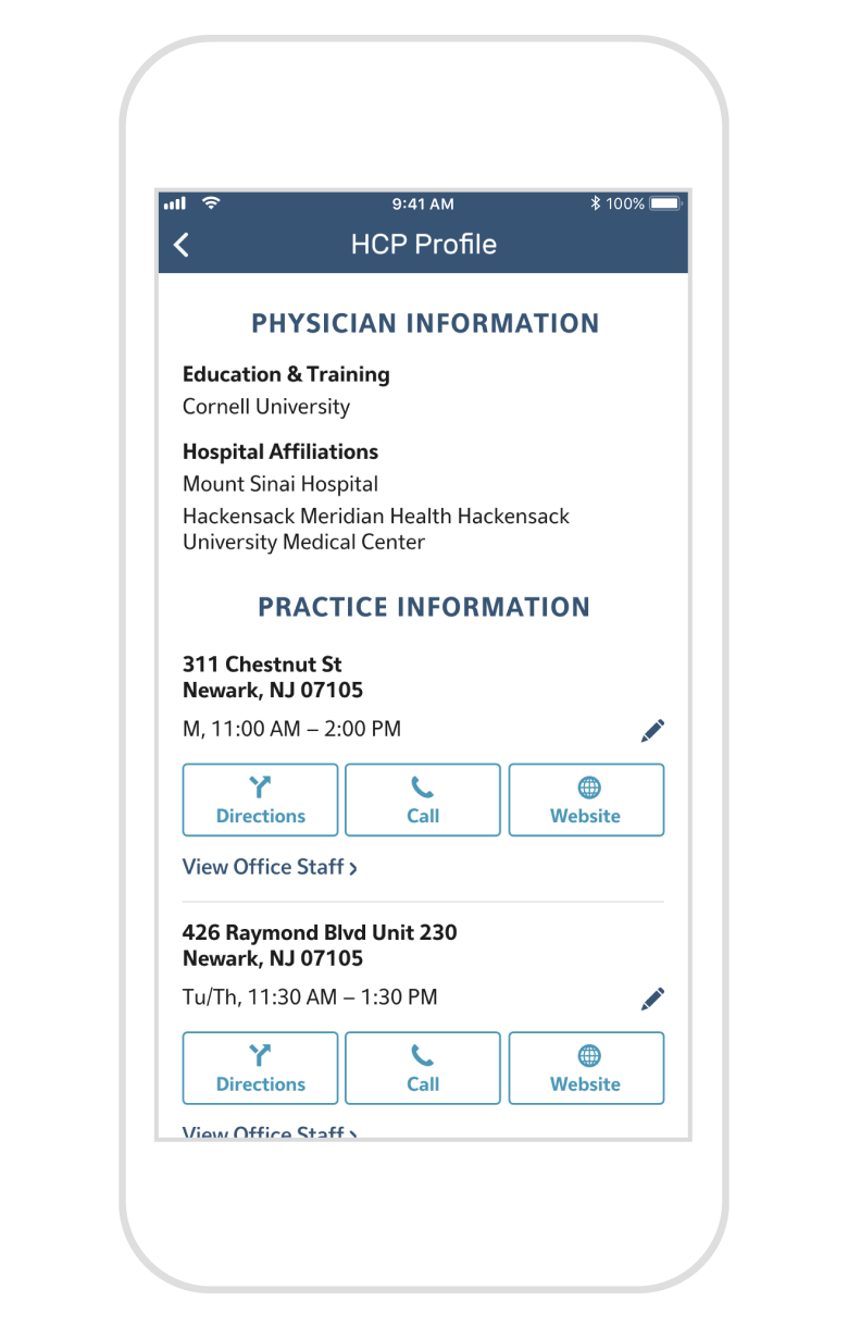
The ability to view office staff and edit office hours were two features that were added as a direct result of user feedback on the previous iteration.
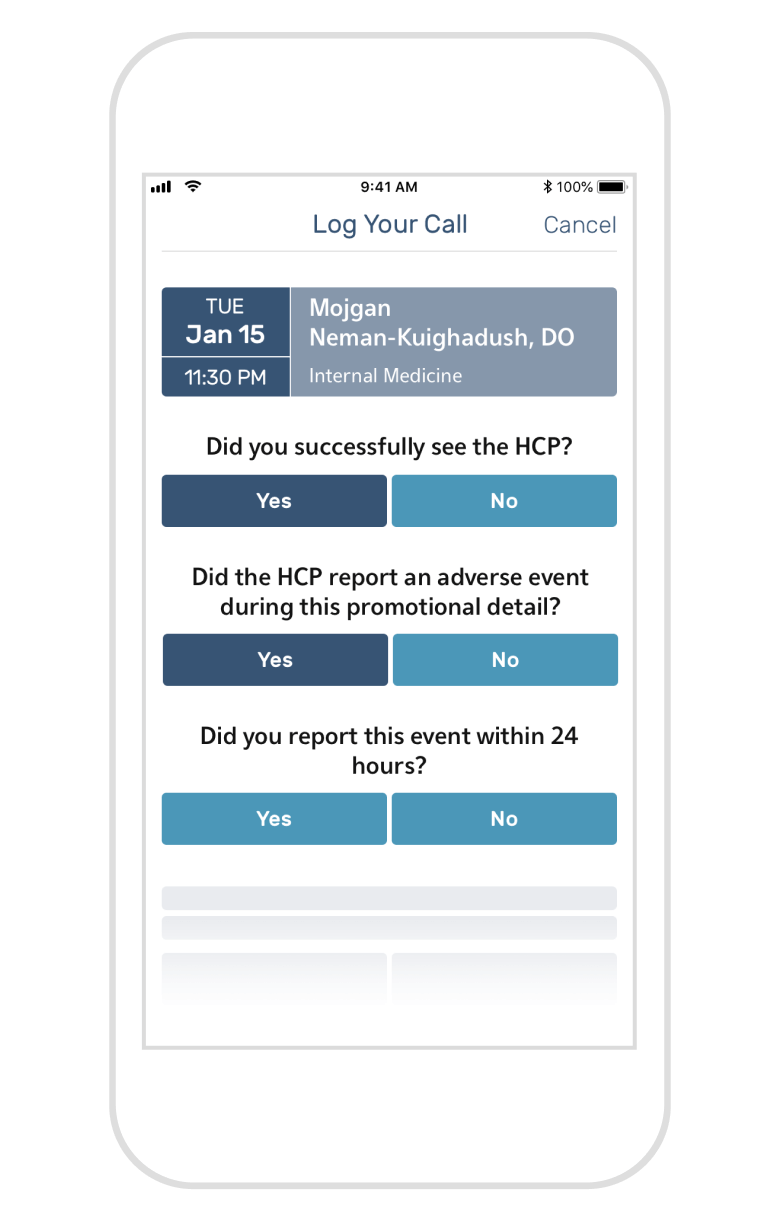
Call Logging & Performance Tracking
The biggest point of friction for a rep is having to log their calls. During the user research phase, we found out this was a task reps tended to put off toward the end of the day or even toward the end of the week. However, logging calls immediately after their completion was a behavior change the client wanted to actively encourage—the longer a rep waited, the less accurate the logs were. To ensure this desired behavior shift, the call log form was kept as short and easy to answer as possible, with branching logic to further reduce the number of questions and therefore the cognitive load required.
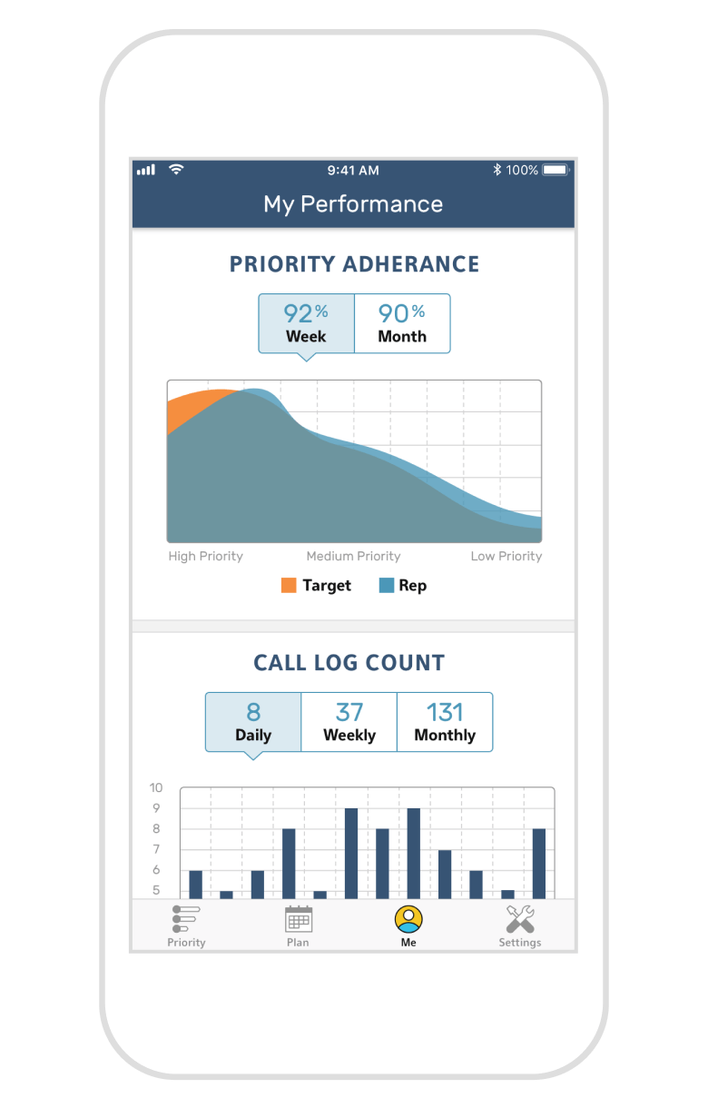
Finally, the client wanted to ensure the sales rep stays motivated to continue performing well. Using dynamic charts and graphs, the Me tab provides an overall view of a rep’s progress and their standing amongst the rest of the sales force. These real-time updates allow reps and their managers to evaluate and adjust their marketing plan much faster.
Impact
The spirit of collaboration as well as the amount of time dedicated to research during discovery was crucial to the success of designing this internal application. Sales reps who had been used to slow and clunky apps/websites were over the moon to see a fully custom solution built with them in mind every step of the way. After an initial round of beta testing and subsequent iteration with their feedback incorporated, the following version entered a period of long-term testing by their sales force, with high levels of satisfaction reported as their sales force took this app into the field day in, day out.
Additionally, the success rate of call logging and the reduction of wait time for logs to be completed far exceeded client expectations—to the point where our initial designs for how the app might further encourage this behavior weren’t even needed. This indicated to us that the thoughtful decisions we made to keep people engaged with the app and reduce friction for their reps' biggest pain points were hugely successful. Designing a mobile enterprise app for a highly specialized use case was a challenge both in terms of UX and visual design, but one I reveled in!
© Isar Chang 2023